Envelopes
One popular method of moving average interpretation is to plot envelopes or bands around the moving average at a set interval as in Chart 1. If the bands are selected carefully, they serve as support or resistance points. In effect, this approach plots a dynamic form of momentum indicator. In my opinion, these envelopes may look good on paper, but they have relatively little practical use since the price often exceeds the envelope boundaries.
However, Chart 1 does demonstrate one very helpful pointer. First of all, we have two simple moving averages at ± 5 percent of a 30-day moving average. Let’s say the moving average itself was at 50. Then the + 5 percent average would be plotted at 52 ½ (i.e., 5 percent above the average). If you look at the period on the left, a bull market, you’ll see that the upper envelope was touched quite a bit, but the lower one not at all. When the lower one was touched for the first time in October, it was a warning that the trend had changed to the downside. In fact, the price was never able to touch the upper overbought envelope during the whole period of the decline; yet, it did touch the lower envelope several times. The rule then, is that periods are likely to be bearish when the upper envelope is not touched and those when the lower line is not reached tend to be bullish.
Chart 1 — J.P. Morgan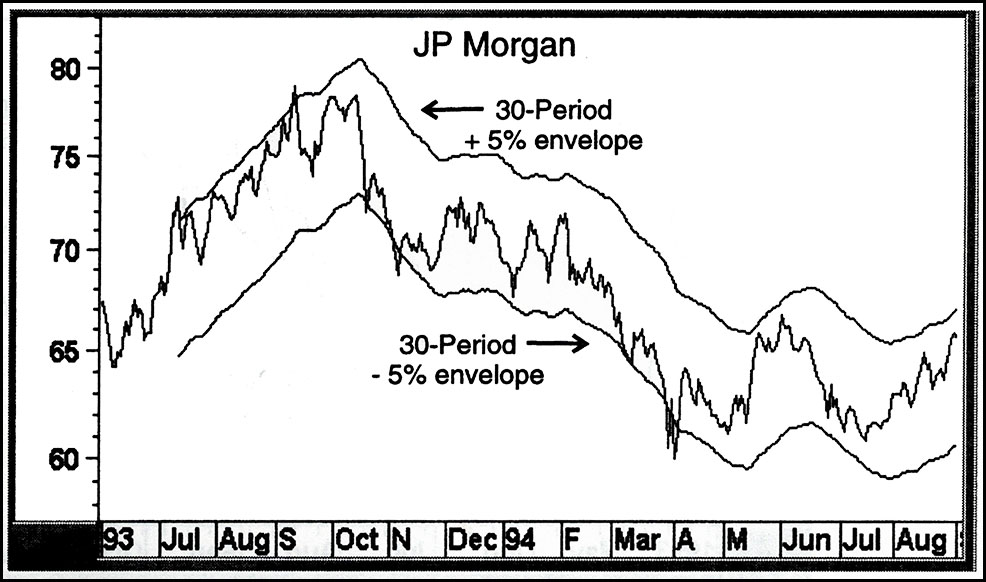
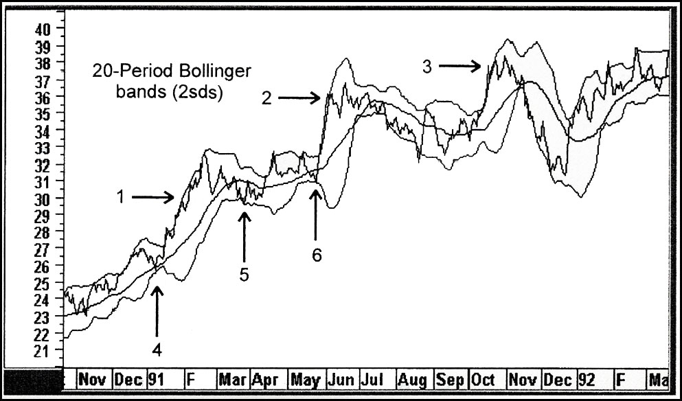
Bollinger Bands
Bollinger Bands are an alternative to the envelope approach. They were developed by the innovative technician John Bollinger. Unlike envelopes, which are plotted as fixed percentages above and below a moving average, Bollinger bands are plotted as standard deviations (Chart 2). What this means, in a practical sense, is that the two bands expand and contract as the volatility of the price series changes.
The lower panel of this chart compares the price with two 20-day moving average envelopes. The top panel does the same thing with 20-day Bollinger bands. The 20-day time span is recommended for shorter-term intermediate price moves. It’s apparent that the Bollinger series in the upper panel is much more sensitive to price changes in sharp up or down trends.
Chart 2 — International Paper
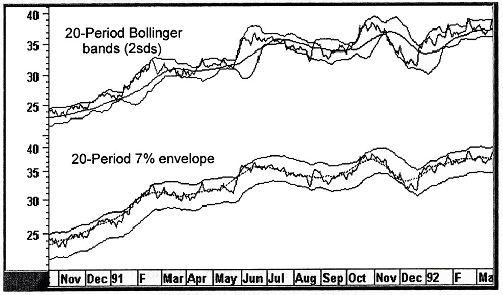
Chart 3 eliminates the lower panel so we can take a closer look at the Bollinger band. You can see that the price occasionally moves outside the band for a day or two but is normally unable to sustain itself in this position. When the trend moves persistently in one direction, such as in early 1991 at Arrow 1, touching the upper band no longer offers a timely signal. This is much the same as a momentum indicator, which is virtually useless when a persistent trend is in force. It’s the exception rather than the rule, for in most cases, when the price moves above the band and then back below it, an exhaustion move has set in from which a correction follows. Look at what happened to the price at Arrow 2 and again at Arrow 3. These were clearly great places to take profits.
Also, if you have a good idea from the other technical indicators of the direction of the primary trend, it’s possible to use those few occasions when the price moves to the lower band to enter long in a short-term trade. Look at the Arrows numbered 4, 5, and 6 and see what good opportunities they were.
Chart 3 — International Paper