
If you’re driving a car in a strange city and need to get directions, it’s easy to open Google Maps. Even easier if your car is equipped with a voice recognition navigation option! Wouldn’t it be great if you could also Google an investment map pinpointing the market’s proximity to major tops and bottoms? Well, you can—up to a point! The KST Market Cycle Model, (Figure 1) is an analytical approach that can help you, just like a map. Of course, no system is perfect, but the KST approach has been proven dependable to help put the odds in your favor.
How Does it Fit into the Bull and Bear Cycle?
The green line represents primary trend price movements; those that revolve around the business cycle and last on average between 9 months to 2 years. The blue line represents intermediate trends. These last anywhere from 3 weeks to many months and retrace between one-third to two-thirds of the previous primary movement. These secondary corrections usually develop because of a temporary change in the perceptions of investors towards the economic or financial outlook.
In turn, intermediate trends are interrupted by even smaller ones lasting from a few days up to three weeks. These short-term price movements (the dashed brown line) are usually caused by random reactions to news events that typically have little or no bearing on the business cycle.
Figure 1 — The Market Cycle Model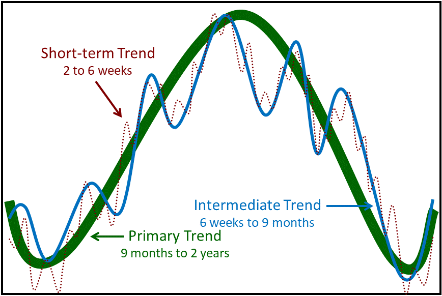
From an investment point of view, the best time to buy is when all three trends are bottoming. Unfortunately, that is the most difficult time to part with your money because prices are only that low because of bad news, which is abundant at the time. Conversely, the riskiest point occurs when the news is good, and confidence is highest. That encourages everyone to buy, just at the time when they shouldn’t!
The KST Market Cycle Model consists of three oscillators which reflect the primary, intermediate- and short-term time frames, shown in Figure 1. In Chart 1 the momentum that reflects these trends has been stacked, compared to the overlaying process featured in Figure 1. These are no ordinary oscillators but have been specially constructed to take into account the fact that price trends are influenced by the simultaneous operation of many different time cycles. Moving average crossovers by the KST indicators generate timely signals of short-, intermediate- and long-term trend reversals, but keep whipsaws, or false signals, to a minimum.
Chart 1 — The Market Cycle Model for the iShares MSCI ACWI ETF (ACWI)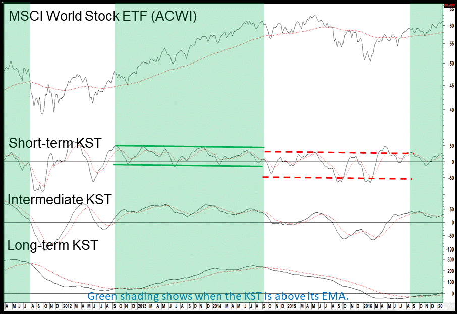
The most important thing to bear in mind, is the direction and maturity of the primary trend. Short- and intermediate signals, which are triggered in the same direction as the main trend, result in the strongest rallies. Signals which go against the main trend generally give false indications. You can see the differing bull/bear characteristics from the fact that the green parallel lines marking short-term KST turning points under the context of rising long-term momentum, are higher than their (red) bear market counterparts.
The KST Market Cycle Model can be constructed for any financial instrument influenced by the business cycle. It’s also a very effective tool for relative strength analysis, and is utilized as an analysis tool in each edition of our InterMarket Review. This arrangement can also be plotted in the StockCharts.com platform and the MetaStock charting package. The formulas for the various trends are listed below in Table 1.
Table 1 — KST CALCULATIONS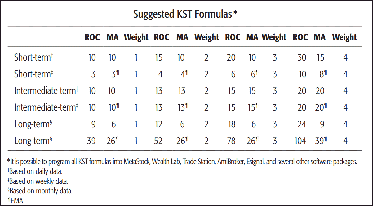
Related Article: Nirvana Template