An expansion of bank credit is the food which feeds economic growth. Alternatively, a lack of credit, as reflected in monetary tightening, starves the economy and results in a recession. When the central bank perceives that recession is a reality, it pumps in liquidity causing interest rates to decline. Credit becomes more available as banks first step up their purchase of government securities, then later on doing the same for individuals and corporations.
Chart 1 compares the inflation adjusted S&P Composite to a ratio between stocks and bank credit. We think that adjusting equity prices for inflation offers a more accurate picture of equity performance when long periods of time are being considered. An expanding level of credit is bullish for the economy, as it provides the liquidity to finance economic growth. When stocks rally at a faster pace than bank credit, it means equity investors believe the economy will expand at a healthy clip. It’s also positive when bank credit contracts, but stocks less so. That’s because equities are a forward-looking indicator and are anticipating a period where bank credit, and therefore business activity, is about to pick up. Alternatively, when bank credit increases and the stock market fails to respond or actually declines, this is a negative factor.
Chart 1 — Inflation Adjusted Stocks versus Bank Credit Secular Trends 1955 – 2020
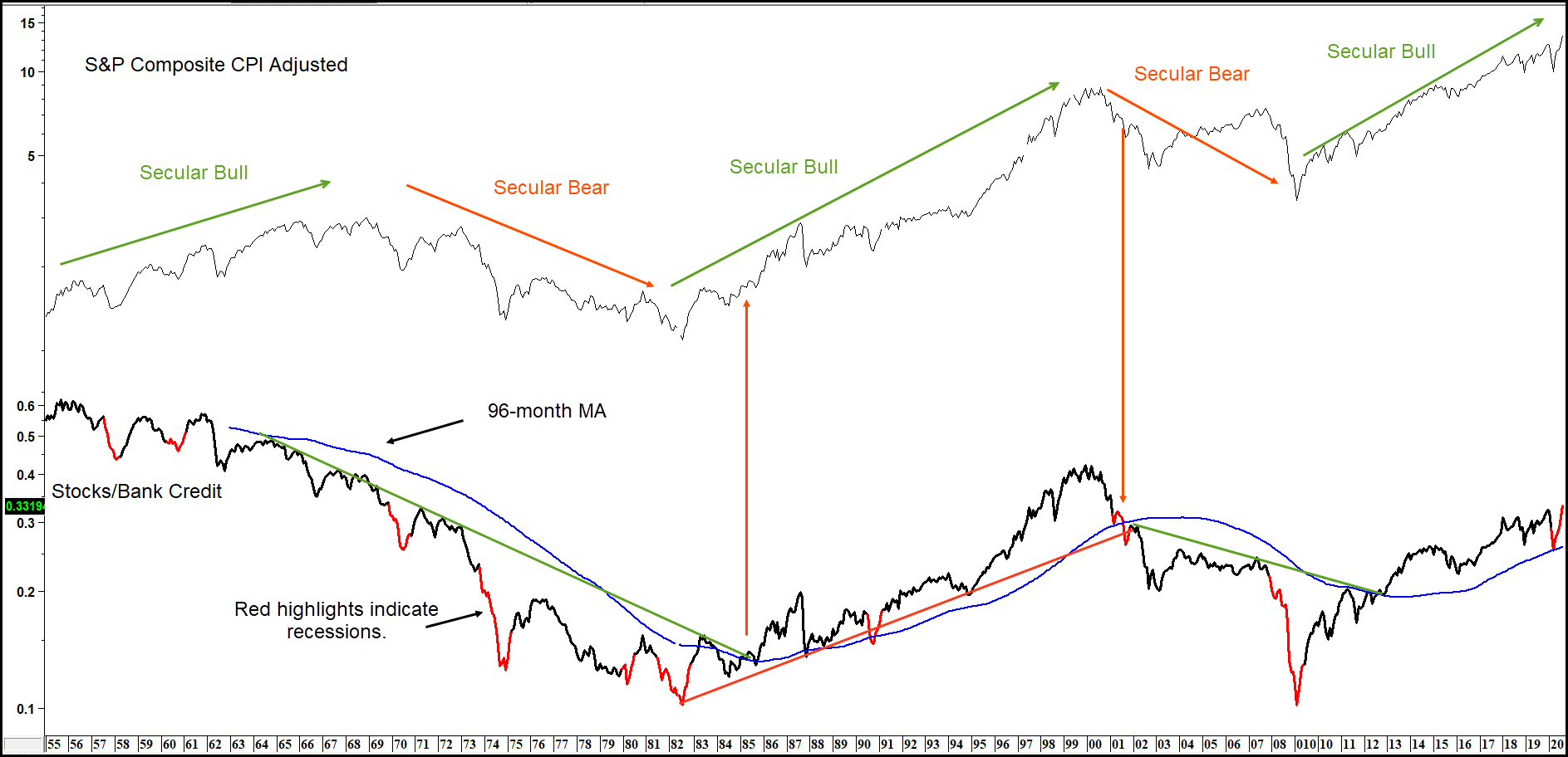
Two things are apparent from Chart 1. First, trendline violations in the ratio have occasionally signaled secular trend reversals in equities. For the record, secular trends are very long-term ones that often extend 15 to 20 years or more, and therefore embrace several business cycles. To a lesser extent, 96-month MA crossovers also signal secular reversals, which have been flagged by the large green and red arrows. This is not a perfect approach as we can see from the 2001-2002 signal. This one left a lot to be desired in the timing department, as most of the initial down leg had taken place by the time of the trendline violation and MA crossover.
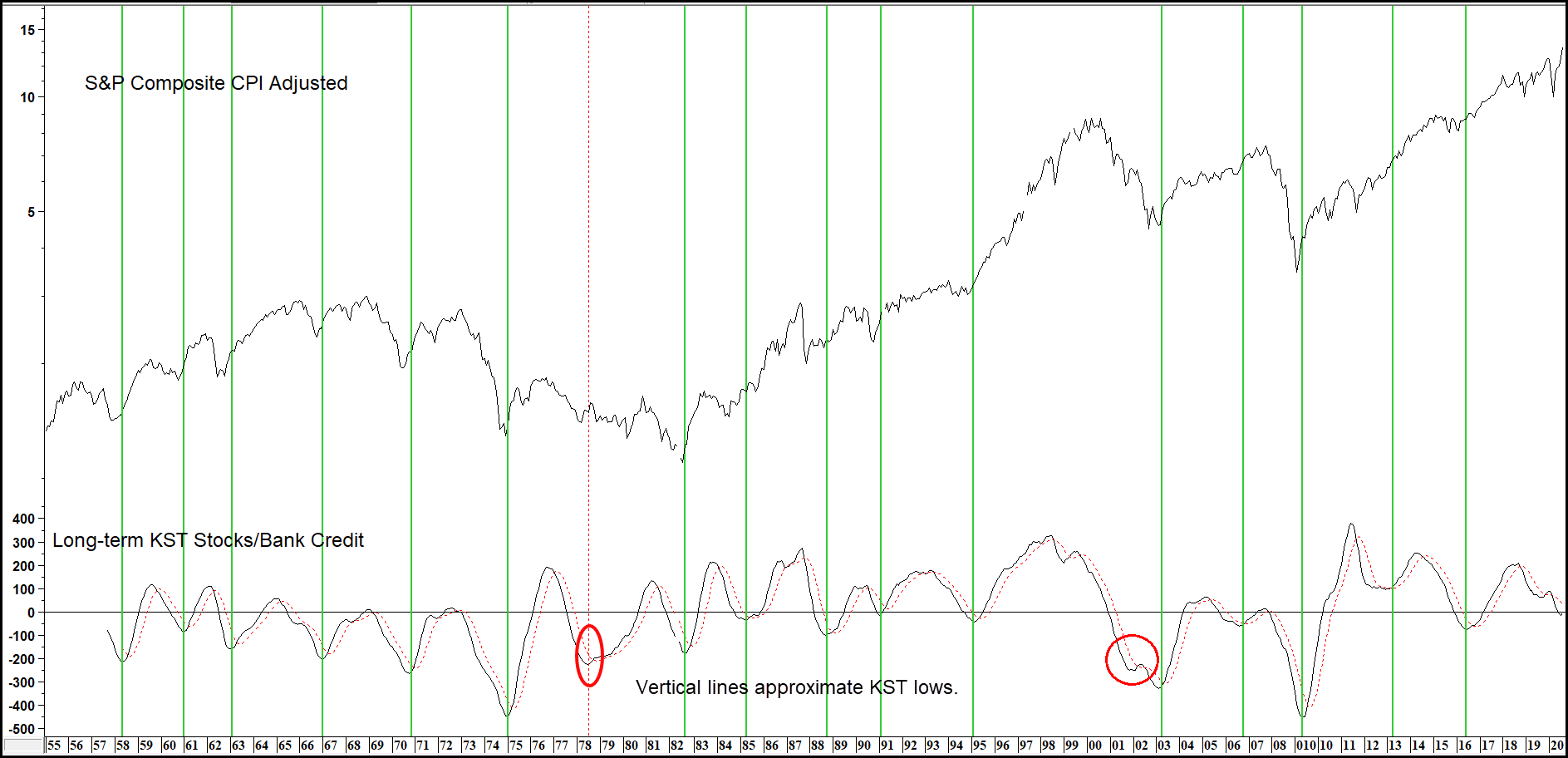
Changes in the direction of the equity/bank credit relationship have also been helpful in identifying primary trend reversals in inflation adjusted stocks. This can be appreciated from Charts 2 and 3, as the red vertical lines indicate equity market tops as the ratio’s KST reverses to the downside. Thick lines represent valid signals and dashed ones, false negatives.
Chart 2 — Inflation Adjusted Stocks versus Stock/Bank Credit Momentum 1955 – 2020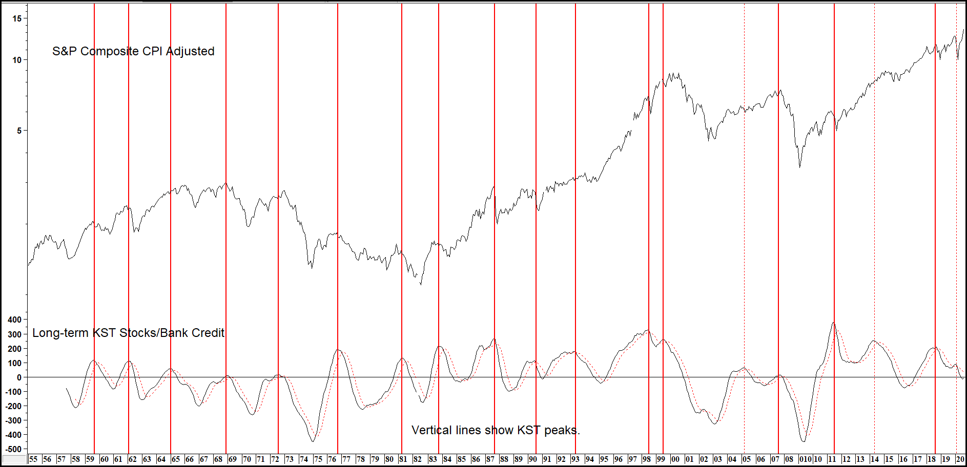
The green vertical lines in Chart 3 show the same thing, but in this instance, we are looking at upside reversals heralding primary bull markets. Dashed lines in both charts indicate the occasional failure.
Chart 3 — Inflation Adjusted Stocks versus Bank Credit KST Buy Signals 1958 – 2020