
A bubble develops when the price of an asset, such as a stock or commodity, has been advancing for many years. The process culminates with an almost exponential rise that push prices to levels that cannot be sustained by the underlying fundamentals, eventually resulting in exhaustion and the bubble bursting.
It is our intention in this article to take a more clinical approach by quantifying what we mean by a “bubble” solely in terms of market action. In that way, it is possible to compare conditions between individual markets and arrive at a rough standard. There are of course, many other aspects to bubbles and manias, several you can read about here.
Measuring Bubble Type Conditions
A key problem is distinguishing a perfectly normal experience, such as a stock or commodity doubling over a five-year period and something that is far more insidious. A good example would be when the S&P grew by a factor of 2.5 in the 10 years separating its 1974 low and 1984 high. Prices seemed a bit heady at the time, but it was no bubble.
One of the required ingredients for a bubble is for prices to inflate slowly and quietly over many years and for this process to cumulate with an exponential type advance. Sentiment plays a huge part, but apart from gut feel, which is not statistically accurate, it is extremely difficult to pin-point the beginning of the unravelling process. That is because there are no long-term indicators that can be consistently applied across multiple markets. Furthermore, when sentiment data is available, it takes the form of short-term polling, rather than information gathered with the purpose of assessing a long-term perspective.
Introducing the 18-month ROC
A useful approach to the study of bubbles is to include a momentum indicator in the analysis. Momentum is useful because it closely tracks market sentiment. Since it is difficult to quantify long-term investor attitudes directly, the obvious solution is to substitute a momentum series, such as a rate of change indicator.
A useful span that tracks the final exponential rise and exhaustion characterizing the turning point of a bubble is 18 months. The rationale lies in the fact that the 18-month period embraces almost half of the 41-month business cycle, originally discovered by Joseph Kitchen in the 1920s. Recessions have been less prevalent since the 1960s. However, when growth slowdowns are counted along with actual contractions, it can be shown that this cycle has been operating consistently since the early 1960s.
The bubble bursting tipping point for the 18-month ROC occurs when it surpasses a reading of 200% and then reverses. Such elevated readings are very unusual, so it is important to note that it takes an immense amount of bullish sentiment to double the price of any market in such a relatively short time span. When people bid prices up to that degree, it usually means they are getting way ahead of the fundamentals, especially as this stage caps 5 to10 years of more or less uninterrupted gains.
Two Types of Momentum Peak
We should also note that there are two kinds of 200% readings. The first follows many years of rising prices and reflects a final climax or total exhaustion of buyers. This is a true bubble and is bearish when it finally bursts.
The second possibility arises when the ROC achieves that 200% coming off a major low or following several years of decline or rangebound activity. This type of action is super positive longer-term because it signifies a young and vibrant bull market. Table 1 shows these momentum thrusts are typically followed by major corrective activity averaging a 42% loss.
Table 1 — Momentum Thrusts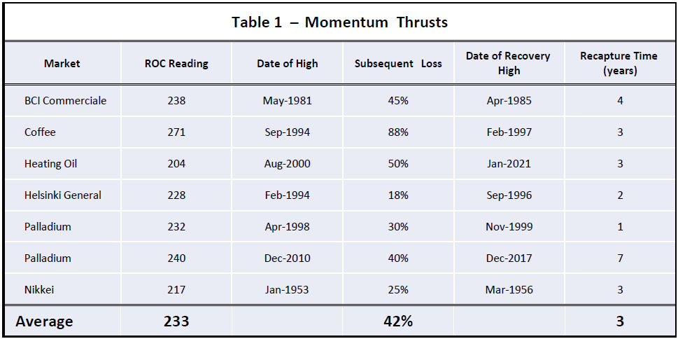
Examples of markets reaching 18-month rate of change readings of 200%that serve as initial stages of longer-term bull markets.
This pause is usually short lived and momentum thrusts are typically followed by new highs in three or so years. Chart 1 shows an example of a momentum thrust for palladium in 2010. At the time, the elevated 1998 ROC reading could have been interpreted as a bubble peak and is one of the few examples we found of a clear-cut false negative.
Chart 1 — Palladium and an 18-month ROC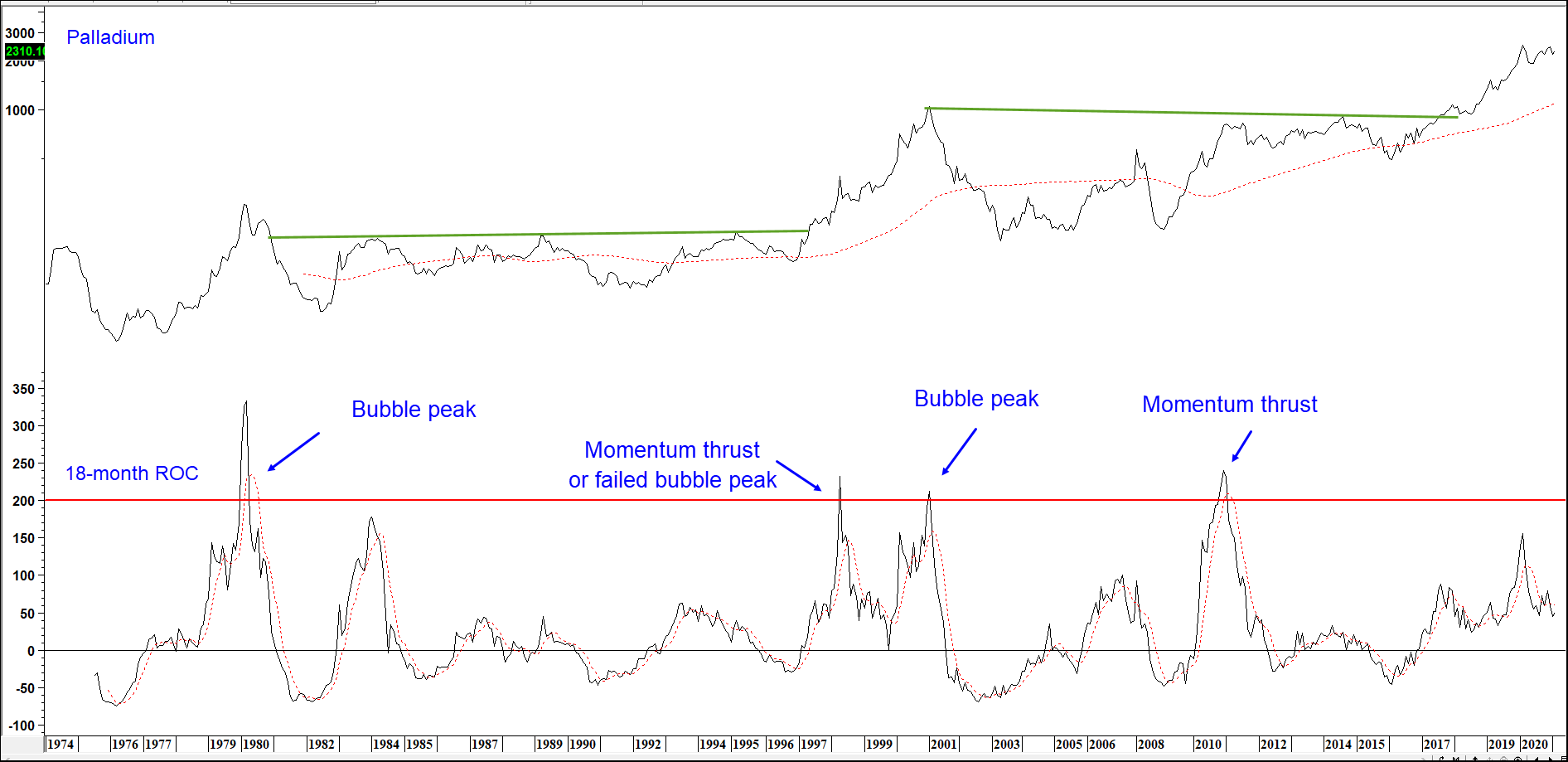
An example of a false reading: The 1980 peak was followed by an 85% decline, which took 18-years to recapture.
Based on our database covering international equity markets and commodities, Table 2 shows all the 18-month ROC readings in excess of 200% that were preceded by a multi-year advance.
Table 2 — Bubble Bursting ROC Readings in Excess of 200%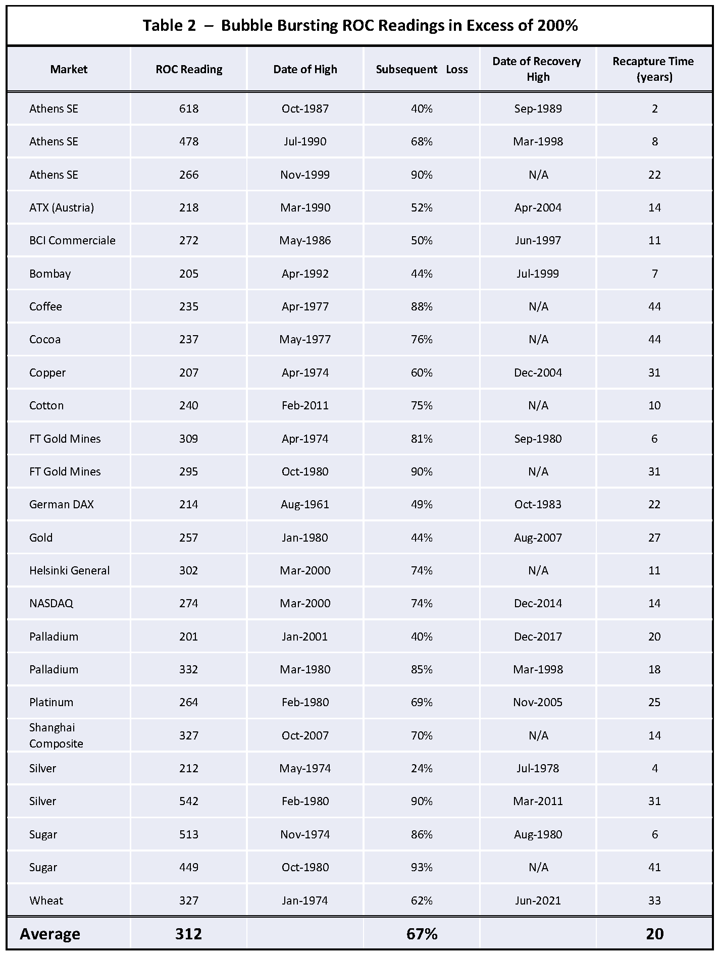
Examples of multi-year advances that ended with 18-month ROC above 200
that were followed by severe bear markets and lengthy recapture times.
The unusual nature of a 200%+ reading can be appreciated from the fact that the highest 18-month reading ever seen for the S&P and its predecessors was 124% in 1844. Indeed, the ROC for the S&P itself barely rose above 100% at the 1929 top! That point also demonstrates that a major market peak does not have to be accompanied by a 200%+ reading, but that a 200%+ reversal is invariably followed by some form of important decline. It is also worth noting that in over 400 years of combined history, the very volatile soybean and crude oil markets have yet to make the “200% club”. Copper has only made it once since 1800! A PDF file that can be found here displays 40 historical charts for commodities and international stock indexes with their 18-month ROC. Taken in total, 200% + readings are relatively rare.
Identifying the Turn
Using the benefit of hindsight, it is really easy to spot the 200%+ peaks in the ROC, but how is this achieved in real time? Fortunately, bubble bursting is mostly an abrupt process that unravels quickly as careless and leveraged positions are hastily liquidated. That means that once a 200%+ reversal is underway, it is usually a pretty straight-line affair on the downside. A negative crossover of a 6-month MA of the ROC often proves to be a timely and objective indication that the tide has reversed. Some bubble bursting examples for silver are featured in Chart 2.
Chart 2 — Silver and an 18-month ROC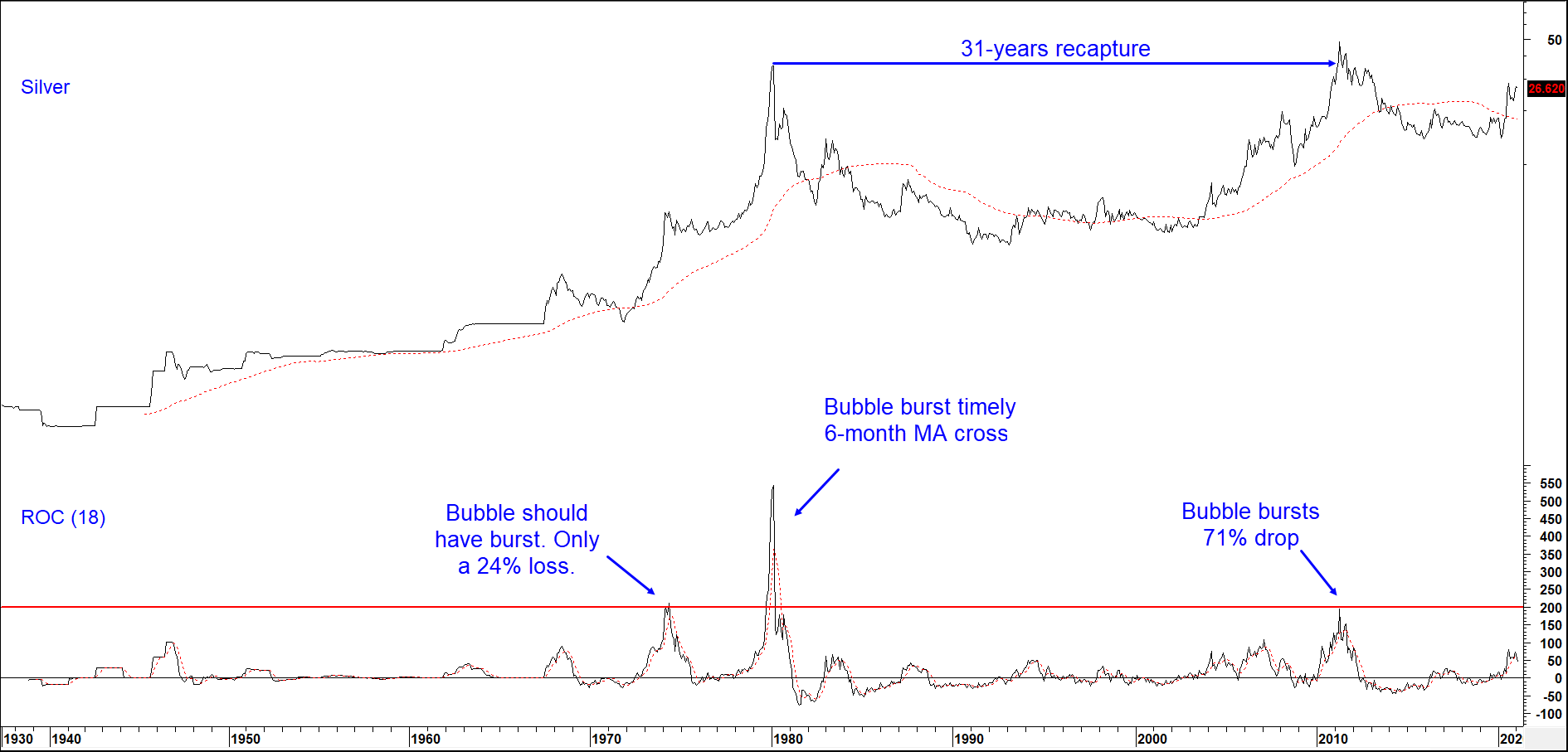
The 1980 ROC peak of 542% was a record until the 2017 Bitcoin reversal.
We can point to exceptions, but there are not many of them. That said, neither the 200% or 6-month MA crossover rules can be profitably and consistently applied to individual stocks as there is too much volatility and too many false signals to make this approach practical.
Referring back to Table 2 of bubble bursting examples, the Subsequent Loss column shows that the average subsequent loss following the bubble peak was a pretty nasty 67% drop. It is also worth noting that about a third of the examples were followed by a drop of 80% or more. The best-case scenario came from silver in 1974, which limited its loss to 24%. Remember, all data is based on monthly closes, so actual losses were slightly more than those cited.
The final column in the table shows that the average time taken to surpass the high registered at the bubble peak was 20 years. That surprising number arises because it takes a lot of time to work off the excessive bullish psychology associated with the ROC peak.
Those labeled “N/A” in the Date of Recovery High column are labeled as such because at the start of 2021, the high referred to had never been surpassed. An example is shown in Chart 3 for the Shanghai Composite, which peaked in 2007 and has never seen those levels since.
Chart 3 — Shanghai Composite and an 18-month ROC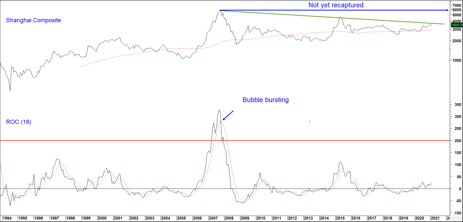
The 2007 Shanghai peak weighed in with a 327% ROC, far higher than
the NASDAQ (274%) at the height of the 2000 tech bubble. Still waiting to reach the old highs!
As 2021 enters the spring season, using our technical approach, nothing in our universe of commodities and international markets points to a bubble or potential bubble. However, there are two areas outside the traditional ones that are.
NASDAQ (Technology) versus the NYSE Oil Index (Energy)
The first comes not from a specific market, but from an inter-market relationship that has undergone multi-year swings in the last few decades. It is the ratio between the NASDAQ as a proxy for technology, and the S&P Integrated Oil Index as one for energy and resources. Since 2009, energy completely under-performed technology. That has begun to change as the 18-month ROC recently exceeded the 200% level and is now back below its 6-month MA. Note that the re-capture period for the 2000 top in this relationship took 20 years. These swings, of course, say nothing about the absolute prices of its two components. Merely that long-term leadership is in the process of reverting away from technology and moving in the direction of energy and other resources. Up to now, purchasing technology stocks has, like the Nifty Fifty of bygone years, been a one-way decision ─ just buy! It looks like that is changing.
Chart 4 — NASDAQ Composite vs the /NYSE Oil Index and an 18-month ROC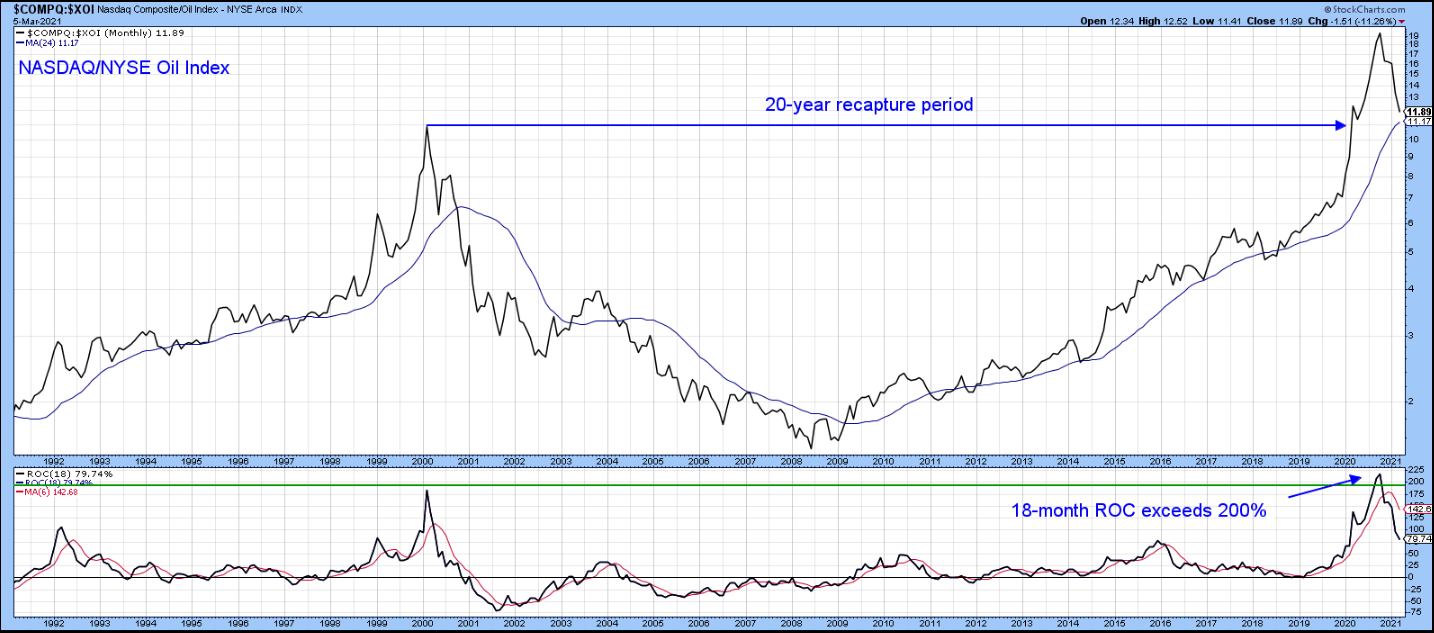 Source: StockCharts.com
In similar fashion to the reversal in 2000, a major change of leadership may have just arrived!
Bitcoin and the Bubble?
Genuine bubbles take many years to form as they need to be preceded by a multi-year advance, extending at least four years. The publicly recorded Bitcoin price history only goes back 2 to 3 years prior to the 2017 ROC peak. That is not long enough to establish a bubble path. Hence, we are treating the 2017 ROC peak as a momentum thrust. Clocking in at over 2,000% percent, that is some thrust! Its subsequent action certainly meets the characteristics of a Table 1 candidate. First, following a 200%+ reversal, it experienced a relatively shallow and brief correction. Second, it achieved a new high within a 2-3-year period, underscoring solid upside momentum.
Now that the price has established a multi-year history of advancing, it qualifies as a bubble under our approach. Bitcoin seems to be the new crypto craze today for everyone from the waiter at dinner last night to Warren Buffet – everyone wants to jump on the Bitcoin bandwagon and is talking about it. Whether this craze is due to the current economic/political environment or speculation, that kind of thinking is certainly consistent with the late stages of a bubble.
Chart 5 — Bitcoin and an 18-month ROC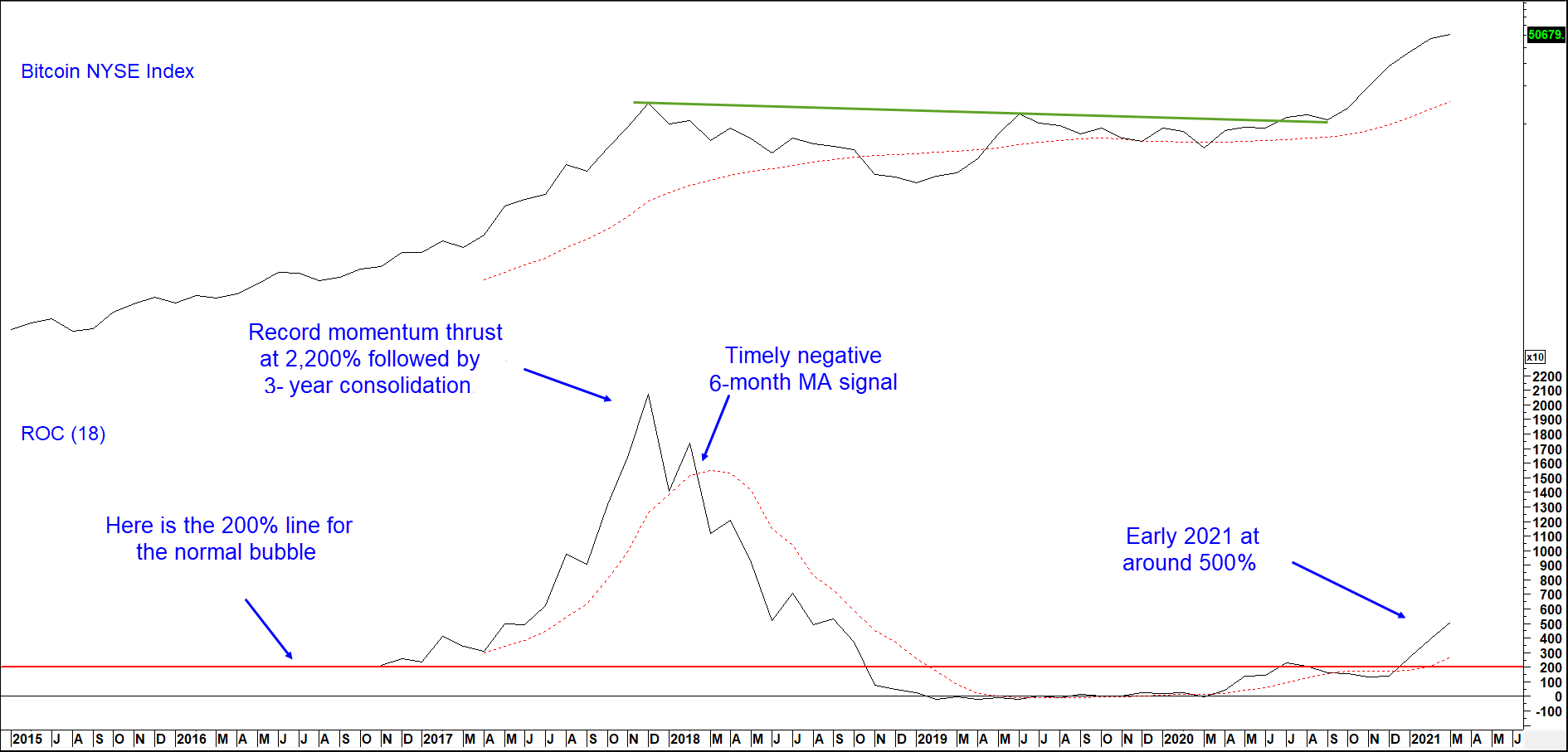
At a 500% ROC reading Bitcoin is overstretched but showing no signs of a reversal.
The latest data supports this idea as its ROC is above 500%. However, there is no sign of a top. After all, the ROC is rising and well above its 6-month MA. To put this in perspective, silver, the previous commodity record holder, topped out with a 542% reading at its 1980 high. However, until Bitcoin shows credible signs of a topping out process as detailed in prior bubble bursting examples, calling a reversal could prove premature and perhaps hazardous to your financial health.
A better appreciation of the history of market bubbles should help advisors and their clients sidestep some of the carnage when they inevitably burst. We firmly believe that paying attention to past secular and cyclical market extremes is one of the best ways to make active asset allocation decisions to both grow and protect wealth.
If you enjoyed the article, check out the InterMarket Review! Our monthly newsletter offers in-depth analysis, proprietary charts and Martin’s unique perspective of the world’s markets. A must have for any serious investor. Click here for more information. Thanks for reading!