
Price is determined by the interaction of multiple different time cycles at any given point in time. A momentum indicator that’s constructed from only one-time span, such as a 14-day relative strength index (RSI) or a 10-day rate of change (ROC) then, will only reflect the cycles that are close to the defined parameter. The KST indicator was intentionally created using several time cycles that build a broader visual picture of the market. The inclusion of moving averages in the formula, results in an oscillator that is smooth, does not turn prematurely, and reflects the underlying cyclical waves.
Chart 1 shows the iShares PHLX Semiconductor ETF (SOXX) along with two indicators. The oscillator in the center of the chart is a smoothed 30-day rate of change. Even though it’s constructed from one-time span; i.e., 30-days, it clearly reflects the underlying short-term price waves. Unfortunately, it often turns well after the price has changed direction to the extent that on many occasions, most of the move has already taken place.
Chart 1 — iShares PHLX Semiconductor ETF (SOXX) and Two Indicators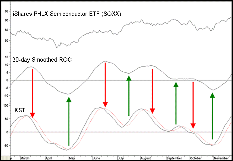

The KST resolves this problem by including time frames that are shorter than 30 days, so the basic waveform of the smoothed ROC remains, but the indicator turns closer to the peaks and troughs of the price. The greatest weighting, and therefore the most dominant, belongs to the longest (30 day) time span. The short-term time periods do have influence at the margin, but not to the extent of creating a large number jagged or whipsaw signals.
Chart 1 also shows the close similarities in the oscillations of the KST and the ROC because both signal reversals in the short-term trend. The upward and downward pointing arrows point to peaks and troughs in the ROC. If you look carefully, you will see that the KST turns ahead of the ROC in virtually every instance, without many whipsaw signals. The KST occasionally gives a false signal, but these are the exception, not the rule. That’s why it is called “K”now “S”ure “T”hing. By and large, the KST maintains a similar waveform with the bonus that it offers earlier signals.
Table 1 — KST Calculations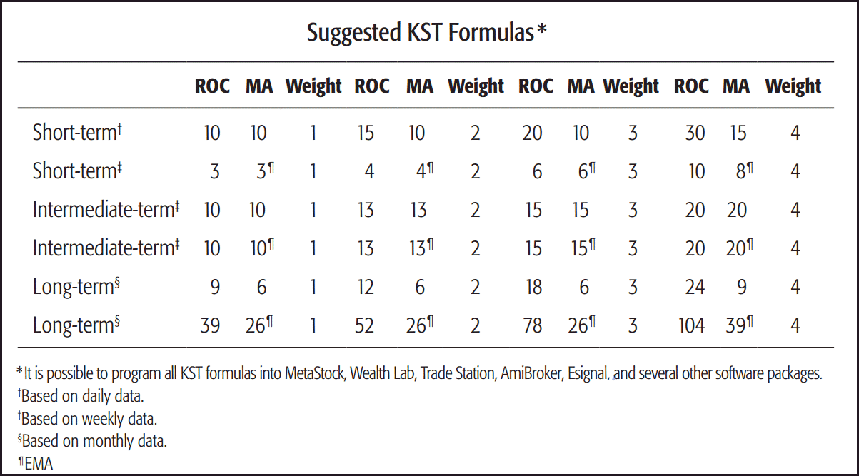
KST Interpretation
1. Directional Changes and Moving Average Crossovers
You’ve discovered how changes in direction are the way the KST triggers signals, but also that moving average crossovers offer less timely, but more reliable signals. The average used on the daily KST is a 10-day SMA (simple moving average). Chart 2 shows that it’s possible to anticipate a moving average crossover if the KST has already turned and the price violates a trendline. The KST started to reverse to the downside before the up trendline was violated. Since either a reversal or a trading range follow a valid trendline violation, it’s evident that upside momentum has temporarily dissipated, causing the KST to cross below its moving average.
Chart 2 — Vanguard Materials ETF (VAW) and a KST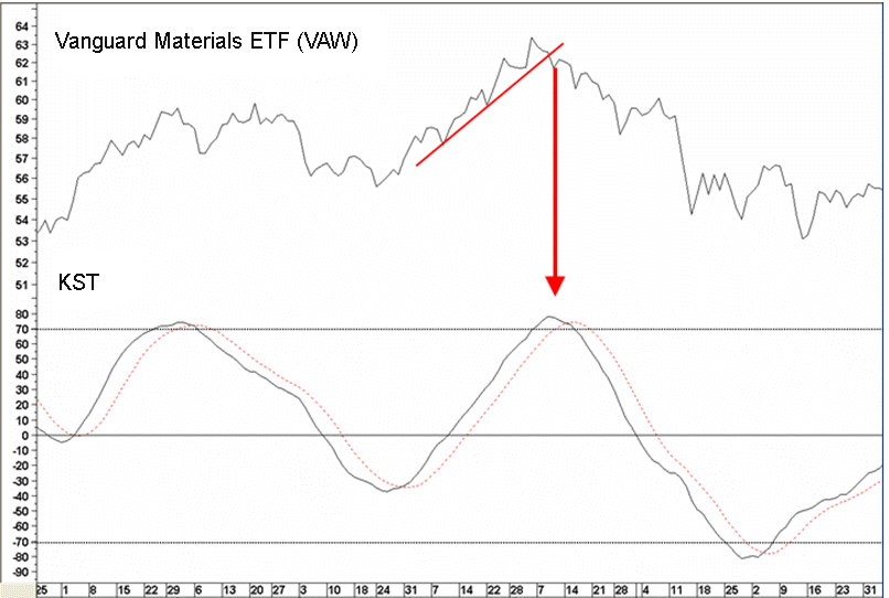
The KST resolves this problem by including time frames that are shorter than 30 days, so the basic waveform of the smoothed ROC remains, but the indicator turns closer to the peaks and troughs of the price. The greatest weighting, and therefore the most dominant, belongs to the longest (30 day) time span. The short-term time periods do have influence at the margin, but not to the extent of creating a large number jagged or whipsaw signals.
Chart 3 compares the KST to a popular oscillator, the MACD. Traditionally, the MACD gives buy and sell signals when it crosses above and below its exponential moving average, known as the “signal line”. This approach isn’t perfect; the ellipses on the chart highlight all the whipsaws. As said earlier, the KST can also give false or misleading signals, as you can see from the April 2005 buy signal. It comes close to a couple of whipsaws, but by and large, it’s more accurate, even though the MACD often turns faster than the KST.
Chart 3 — S&P Composite and Two Indicators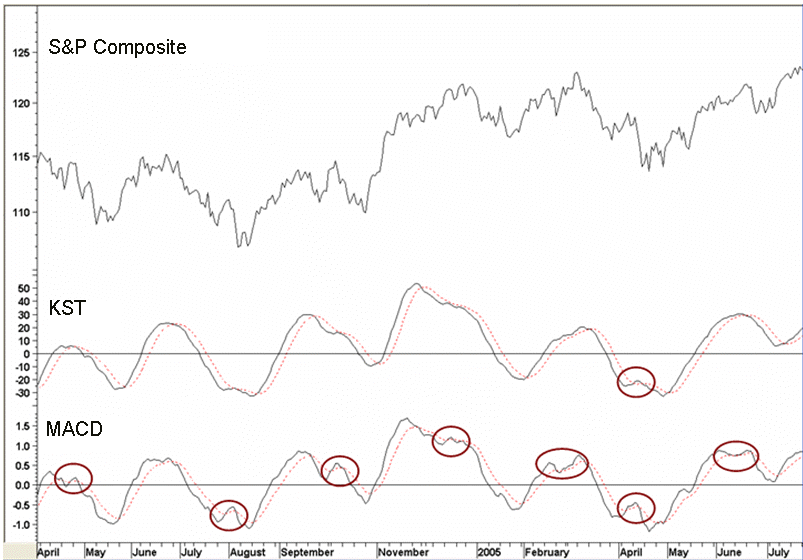
2. Overbought/Oversold and Divergences
Chart 2 shows you can construct overbought and oversold levels for the KST. When the indicator crosses above and below the overbought/oversold zones, momentum buy and sell signals are triggered. Even so, its’ important to await some kind of trend reversal signal in the price, such as a price pattern completion, trendline violation, or similar.
The KST often diverges positively and negatively with the price. In Chart 1, a negative divergence developed in September. Notice how the price had been working its way higher, but the KST peaked in June. The KST then experienced a lower peak in July and struggled to rally in September when it recorded an even lower top. Compare this to the positive divergence in Chart 4, where the price made lower lows between May and late August, while the KST made higher lows, indicating the rapidly dissipating downside momentum.
Chart 4 — Athens General SE Index and a Daily KST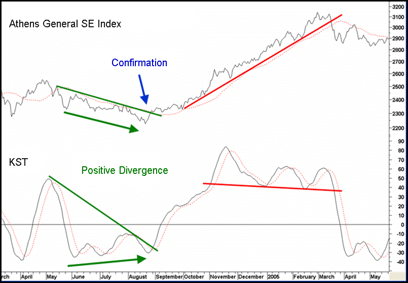
3. Trendline Violations and Price Pattern Completions
It’s possible to construct a trendline on the KST and see when it’s been violated, but not very often. When it does though, a powerful signal typically follows. Chart 4 shows a good example of a positive break that occurred in late August, as well as an example of the KST forming a top. There were three sell signals, November 2004, late January and March of 2005. The first two were false and the third resulted in a decline. The price didn’t confirm the first two bearish signals, but it did violate the up trendline in March and crossed below its 25-day MA for the first time in seven months. Additionally, this example stresses the absolute requirement for KST signals to be confirmed by a price trend signal. After all, you can only buy and sell the price since momentum is not listed on any market!
Related Article: KST System