
Industrial commodity indexes, as opposed to more broadly based series that include agricultural products, seem to have a closer tie to business cycle conditions and therefore to credit market developments. For this reason, we use the CRB Spot Raw Industrials as our benchmark. This index consists of 18 industrial commodities, of which only cotton can be said to have a weather driven influence. Also, the vast majority of its components are traded among commercial users and producers and are less open to speculation than exchange listed commodities.
In constructing the Inflation Barometer, we recognize that no one indicator will ever perfectly identify every major turning point. However, if several individually reliable series are combined into a consensus indicator, better results are obtained. It’s also important to back test over many decades incorporating periods of inflation, deflation and crises in order to end up with a robust end product.
Inflation Barometer Components
We call this consensus indicator the Inflation or Commodity Barometer. It comprises four components; two being trend driven. The remainder are derived from inter asset relationships including the trend of equity prices, which are a leading economic indicator. When stocks are bearish, it tells us that the economy is likely to slow. Since business activity is the driving force for the demand side of the commodity price equation, weakening equity prices set the scene for a peak in industrial commodity prices. The reverse operates at the end of the equity bear market. In other words, a rising equity market forecasts an improving economy. So, when the commodity trend component kicks in, we are well on the way to a buy signal.
This model is designed to identify primary trend reversals in the industrial commodity space. Primary trends are defined as approximating 1- to 2-years in duration. Their principal driving force are changes in business cycle conditions.
How it Works
The Barometer has a score that ranges between 0 and 100%. Based on a 2-month MA, a reading of 50% or higher is bullish and below 50% is bearish. Charts 1 and 2 compare the progress of the CRB Spot Raw Industrials to the Inflation (Commodity) Barometer since the mid-1950s. The red highlights approximate the bearish periods when this model experienced a reading of less than 50%. Green reflects bullish readings of 50% or greater. This model is arguably the most accurate of the three we use, having caught most of the major commodity moves in both directions since the mid-1950s.
Chart 1 — CRB Spot Raw Industrials versus the Inflation Barometer 1955 – 1986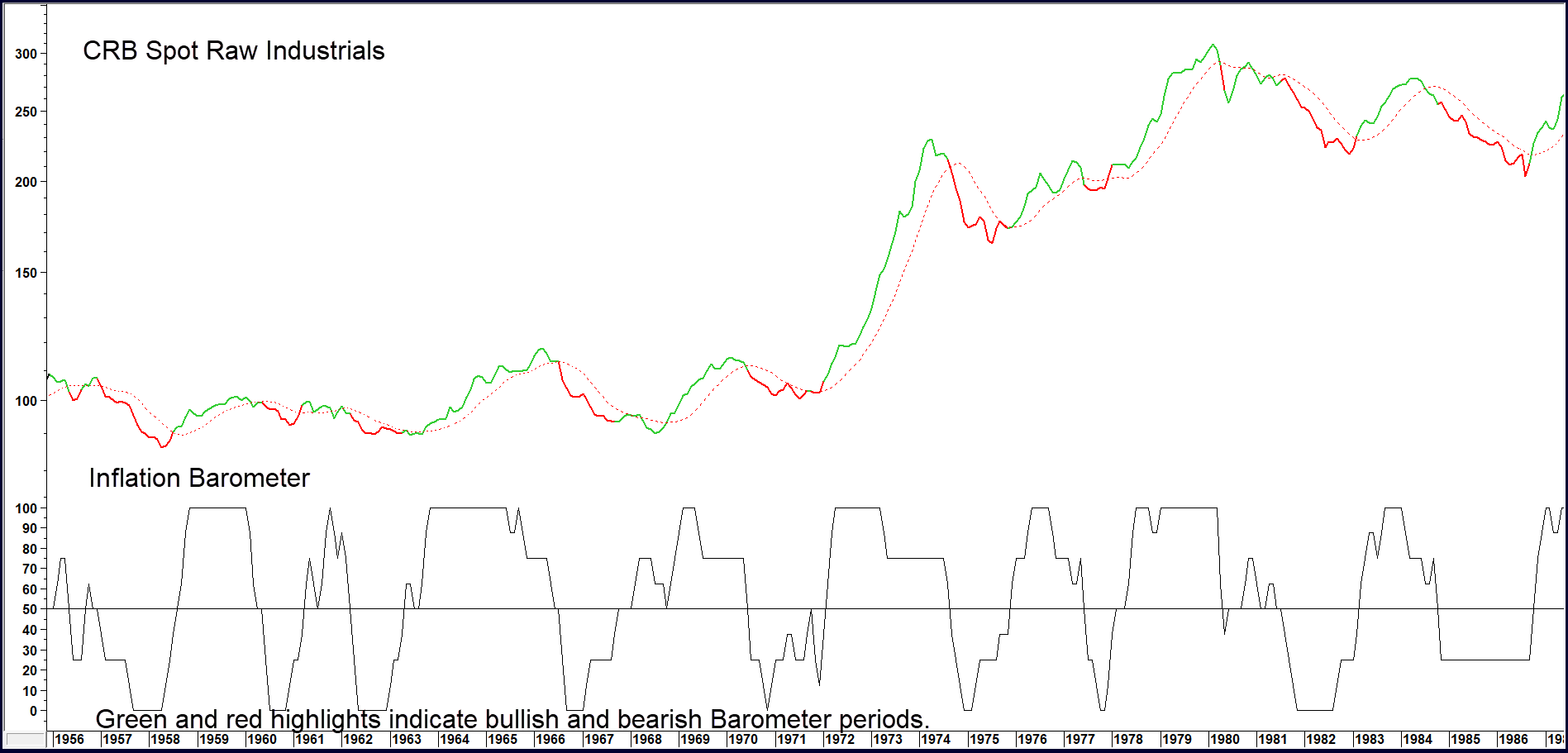
The two ellipses in Chart 2 show losing buy signals. This underscores the point that primary trend signals that move in the opposite direction to the secular trend are the most prone to fail. In this instance, the secular trend was essentially a trading range that began in 1981 and ended in 2001. The word secular in this sense, covers the very long-term trend embracing many business cycles.
Chart 2 — CRB Spot Raw Industrials versus the Inflation Barometer 1987 – 2020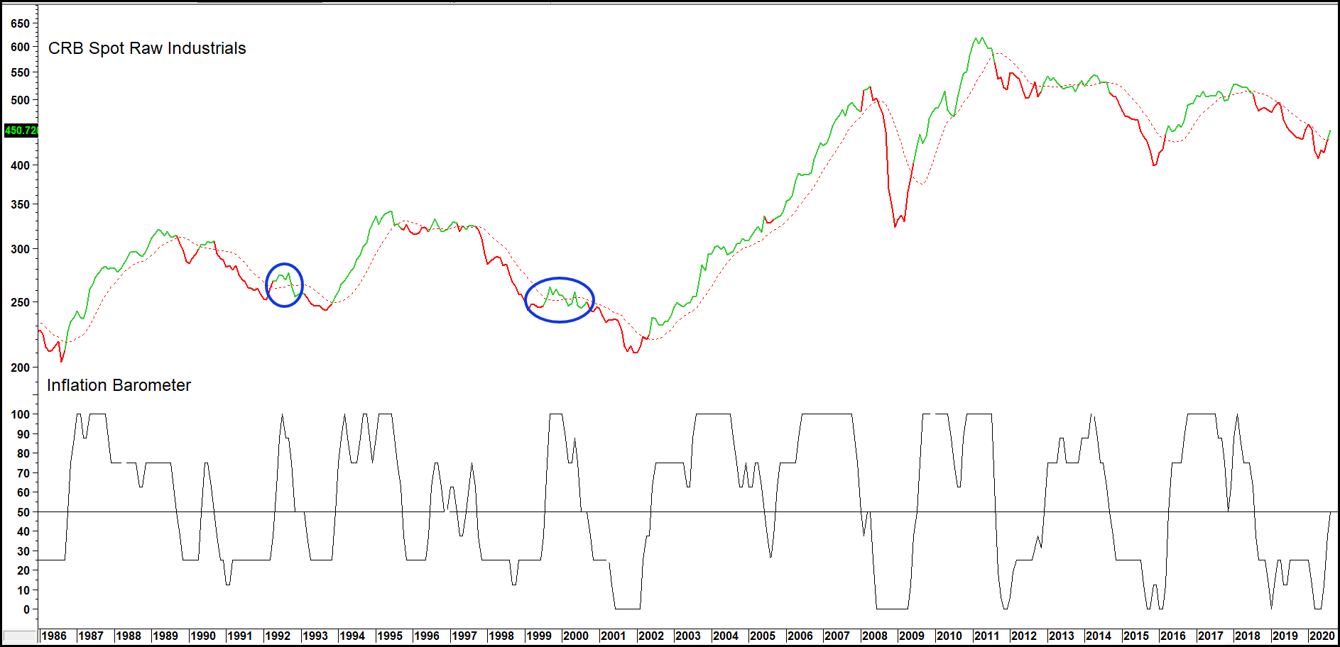
Related Article: Unstable Commodity Model