There are many different cycles that operate over many different time frames. Trying to monitor all these cycles with an oscillator constructed from a specific time span, only reflects the limited number of cycles clustered around that specific time frame. It occurred to me that an indicator combining several different time spans could offer better results. An additional limitation, of say, a ROC, is that the resulting oscillator is typically quite jagged. That means that one- or two-month’s data could easily give a misleading impression that the prevailing trend had reversed.
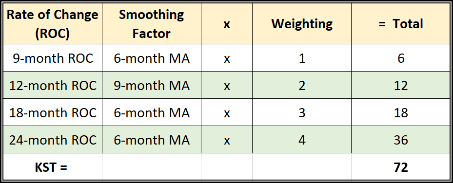
A practical remedy would be to smooth the raw data. In that way, the signals might be less timely, but they would certainly be more reliable in identifying trend reversals. For these reasons, when designing the KST, I combined a smoothed version of several ROC time spans into one indicator. In that way, the longer time spans included in the construction enabled it to reflect the broad trend, keeping false signals to a minimum. At the same time, the inclusion of the shorter-term ones allowed it to turn earlier,
Tired of hearing market forecasters talking about their indicators as if they were guaranteed to make the user rich? I called mine the KST, which is an anacronym for “K”now “S”ure “T”hing. Anyone who has traded and analyzed markets for an extended period of time knows that nothing is a sure thing. However, the time spans used in the construction of the long-term KST does offer a good charting rendition of the economic growth path that revolves around the business cycle.
The concept of a summed rate of change is not new. Joseph Schumpeter used it in his classic book, Business Cycles (McGraw Hill 1939). My late friend, Ian Notley of Yelton Fiscal, adopted this concept for his own cycle work. It was he who gave me the idea to develop my own formula.
The table below shows how the indicator is calculated, along with the corresponding time frames for monthly data. The KST can also be plotted on the StockCharts platform and with the MetaStock charting package.
Table 1 — Rate of Change for the Long-term KST Calculations
The KST concept was originally derived for long-term trends, but the idea of four (4) smoothed summed ROCs can easily be applied to short-, intermediate-, and even intraday trends. I’m not suggesting Table 1 displays the best parameters that can be devised; it’s very likely they could be improved. It’s important though to bear in mind that most of us are looking for perfect indicators, which is an unrealistic objective. The best anyone can hope for is reasonable consistency over many time frames and markets. That’s my objective with the KST.
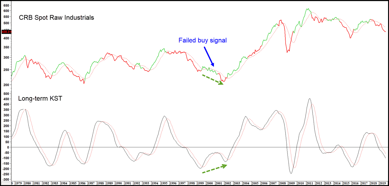
The formula for the long-term KST assumes the series being plotted experiences cyclic rhythms associated with the business cycle. This is what many people call the “primary” trend or a “bull” or “bear” market. Unfortunately, when a linear up or down trend is experienced, the KST, like any momentum indicator, gives false or excessively premature signals. A mild failed signal developed in Chart 1 during the 2000-2001 period. Fortunately, linear trends are the exception, rather than the rule. Recent examples include the Japanese stock market in the 1970s and 1980s, and U.S. equities in the 1980s and 1990s. Also, since the indicator involves several moving averages, the KST is not affected by sudden and/or sharp turns, such as those associated with the 1987 crash or a sudden decline like that which was associated with the pandemic bear market of 2020.
KST signals are triggered, either when the series changes direction, or the indicator crosses its 9-month moving average (MA). The red and green highlights in Chart 1 indicate when the KST is below or above the dashed red line; i.e., its 9-month MA.
Chart 1 — CRB Spot Raw Industrials and a Long-term KST
KSTs occasionally throw up positive and negative divergences, as well. A positive divergence developed between 1999 and 2002, when the Index moved lower but the KST bottomed out at a higher level (this has been flagged on the chart by the two green arrows.) Overbought and oversold zones can also be constructed and used to indicate when the price series in question is close to its normal overbought level. Like all momentum series, KST signals should be confirmed by some kind of a trend reversal confirmation from the price series it’s monitoring. After all, we are buying and selling the price, not the momentum, and price occasionally experiences a linear trend that does not conveniently fall into the usual business cycle rhythm assumed by the KST formula.
Related Article: KST System
