
Chart 1 shows the long-term history for bond yields. The series in question uses the 30-year yield since its inception in the 1990s and is spliced to the 20-year government yield prior to that decade.
Because their trends are much better behaved than their volatile commodity and equity counterparts, secular reversals in yields are relatively easier to identify. The arrows in Chart 1 show the five secular trends between 1870 and 2020. The two completed bull markets for bond yields (bear markets for prices) averaged 30 years, as did the three bear markets for bond yields (bull markets for prices). In 2020, U.S. bond yields had been in a secular downtrend since 1981 or close to 40 years.
Chart 1 — Government Bond Yields 1870 – 2020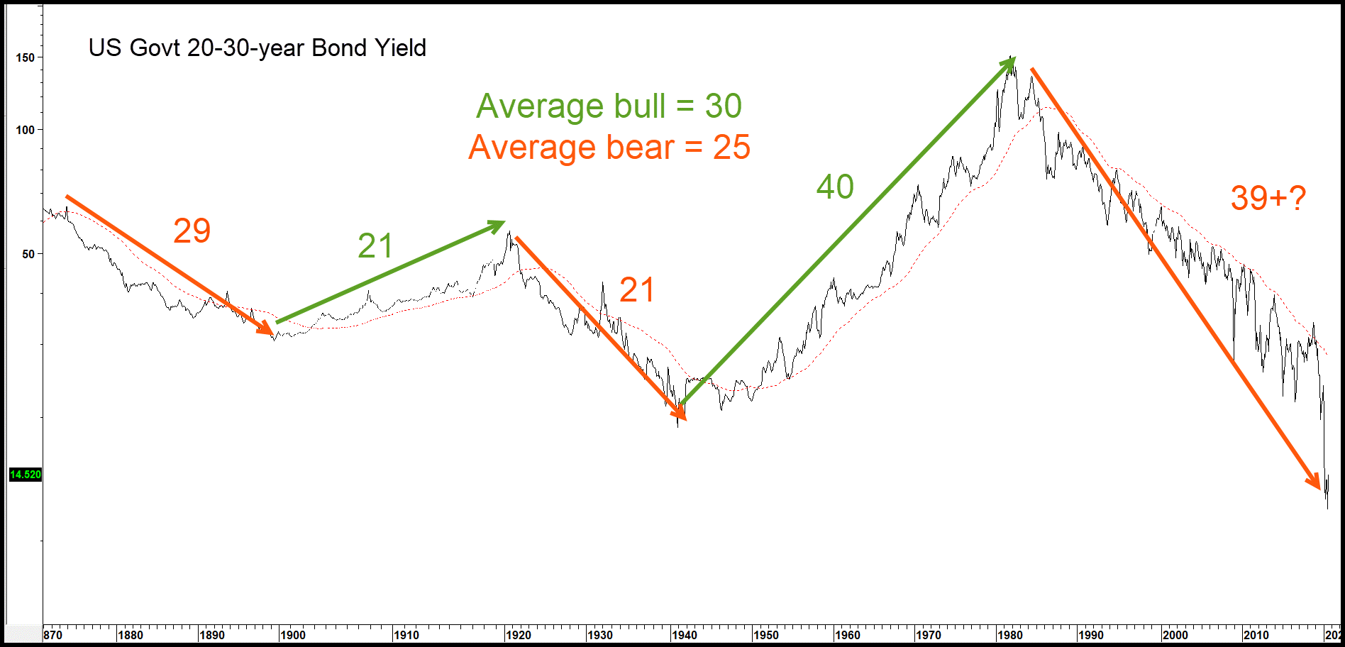
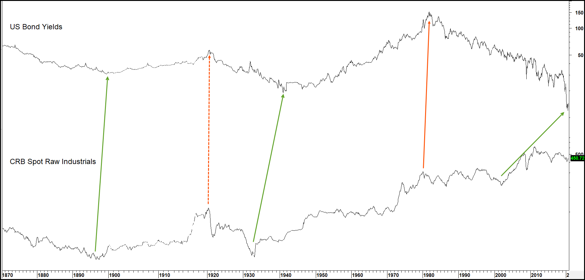
Inflation, in the form of industrial commodity prices, is arguably the biggest driver of the secular trends in bond yields. In this respect, Chart 2 compares the long-term trends of bond yields to commodity prices. The relatively close, but certainly not perfect correlation between them is self-evident. What’s striking is that commodity prices led yields in the three of the four established secular turning points shown on the chart. In 1920 the two reversed more or less simultaneously. Clearly the lead times varied. One could certainly argue the point that the mid 1990s commodity peak was higher than that of 1980. Nevertheless, the record shows that commodities lead interest rates at secular as well as cyclical turning points. Unfortunately, the leads for each one are varied, starting from the simultaneous reversal in 1920, to a 10-year lead time in the 1932-46 period. Even so, the strong secular commodity rally in the 2001-2011 period coming after a 30-year decline in yields suggests that a secular reversal in favor of higher yields, or at least a trading range, was overdue in 2020.
Chart 2 — Government Bond Yields versus a 240-month ROC 1870 – 2020
Identifying Secular Bond Yield Reversals
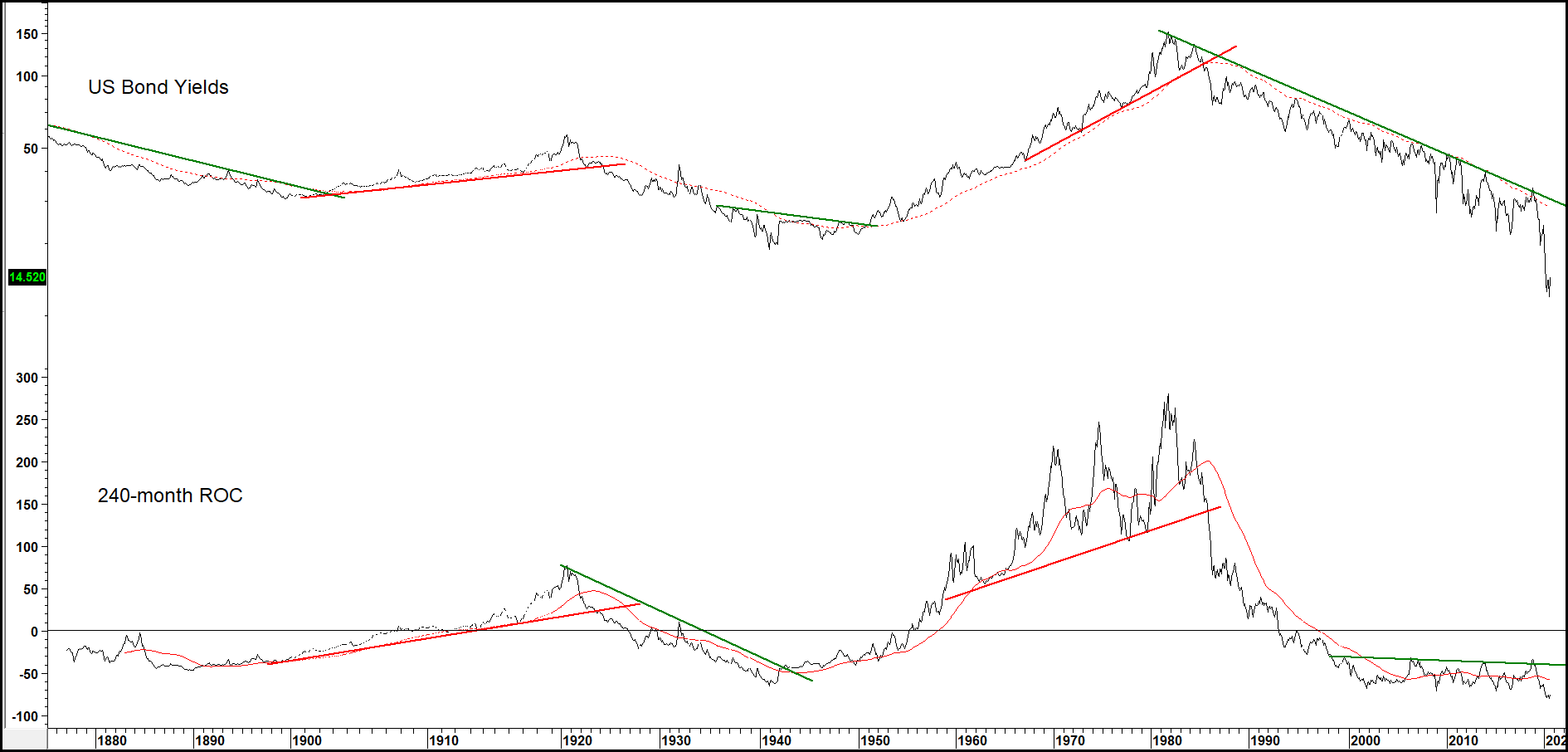
Chart 3 shows that using joint trendline violations of the yield and its 240 rate of change (ROC) has worked quite effectively. At the end of the second decade of the 21st century, the down trendline for the yield and the resistance line for momentum were still intact. At several secular bond market junctures, reversals have been signaled by the completion of bases or distribution patterns. That suggests the 1981-?? secular decline will not reverse on a dime but experience some ranging action prior to embarking on a sustainable trend in a northerly direction.
Chart 3 — Government Bond Yields and U.S. Commodity Prices 1870 – 2020
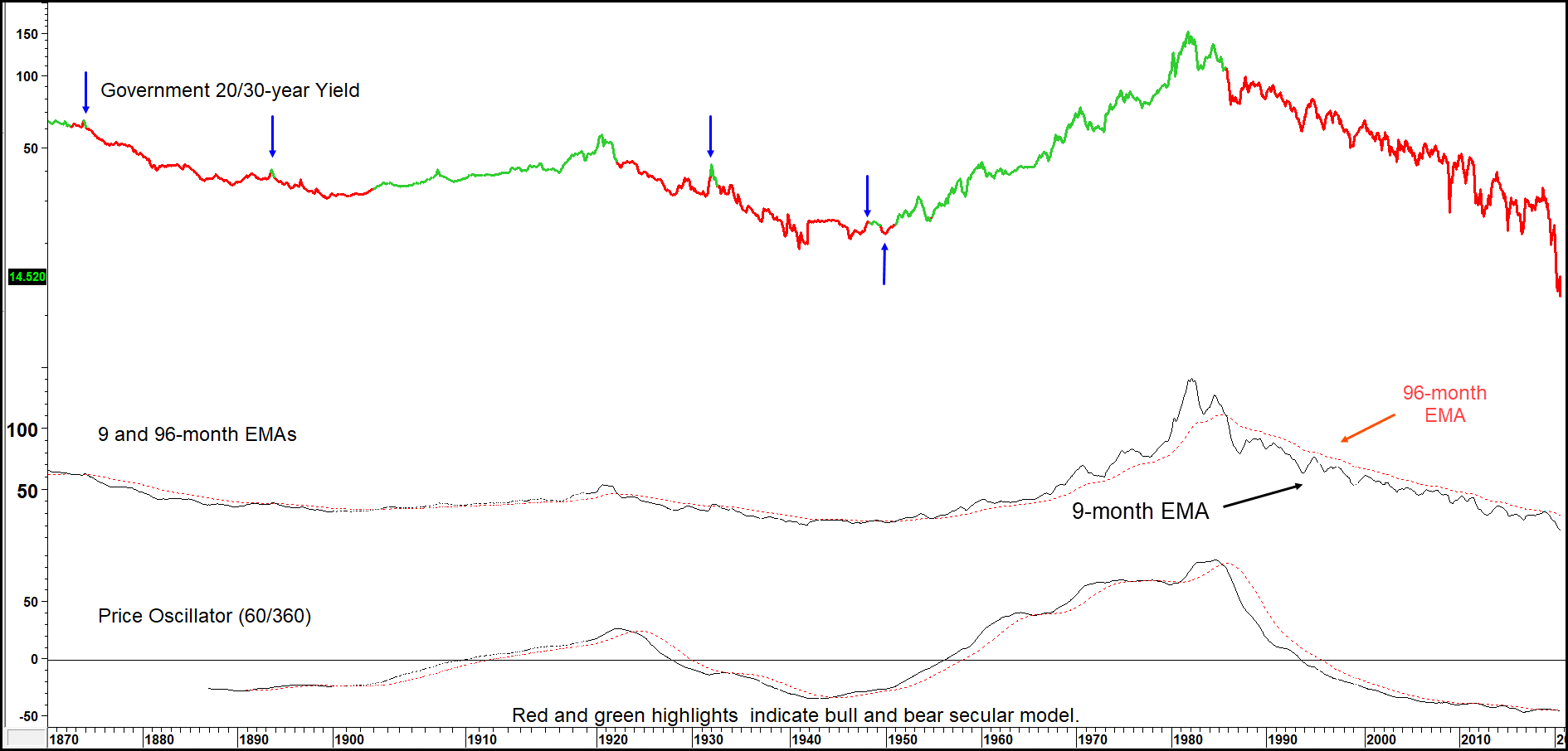
The trajectory of bond yields tends to be smoother than that of stocks and commodities, so a useful combination is to compare a 9-month EMA with that of a 96-month series. This is displayed in Chart 4. The small arrows show the very few whipsaws that have taken place in the last 150-years or so. Note that the green and red highlights reflect when the 9/96-month EMA model is bullish or bearish for yields.
Chart 4 — Government Bond Yields and a Moving Average Model 1870 – 2020
Peak Trough Progression
Peak trough progression is another technique we can be applied to the process of identifying secular reversals in bonds yields. It’s not a perfect approach but seems to work on a more timely basis than most. The idea is that a valid up trend develops when each successive peak is higher than its predecessor as is each successive trough. In this instance, a peak is a rally high associated with a specific business cycle and a low is a low associated with the contraction or slowdown. When the series of rising peaks and troughs gives way to one of lower peaks and troughs, a trend reversal signal is given by this technique. What’s not indicated is the magnitude and duration of the new trend. That would be nice to know, but a warning on the direction is not to be sneezed at. Downtrend reversals are signaled in exactly the opposite way with a series of rising peaks and troughs replacing a declining trend. It shouldn’t be assumed that this technique will work in every situation, but it’s surprising how effective it can be, especially when used in conjunction with moving average crossovers and trendline violations, etc.
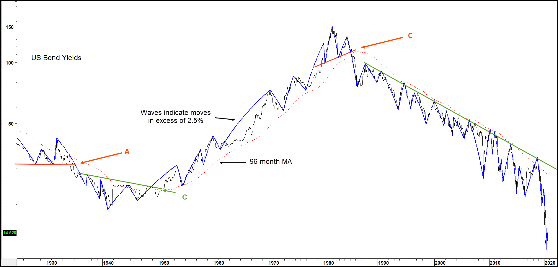
The solid wave forms in Chart 5 represent movements in excess of 12.5% and are used as a basis for objective measurement of what constitutes a legitimate peak or trough. The first signal at A is actually a re-confirmation of the secular downtrend that began in 1920. The series of declining peaks and troughs had been interrupted in early 1932 with a higher high. Since the 1931 low was slightly below its predecessor, the declining troughs were still intact. Point B shows the reversal of this decline in the late 1940s. The yield then continued to trace out a series of rising peaks and troughs until point C in the early 1980s. As the chart closes in 2018, the downward peak tough progression continues.
Chart 5 — U.S. Government Bond Yields and Price Swings Greater than 12.5%
Secular Trends Dominate the Characteristics of Primary Trends
Just as the primary trend determines the characteristics of shorter-term price movements, so the direction of the secular trend influences the magnitude and duration of primary trends that fall beneath it. During a secular bull market, a primary uptrend has greater magnitude than a primary bear market that develops in the same environment. An understanding of the direction of the secular trend clearly puts you in a very powerful position. For example, if it’s correctly concluded that bonds are in a secular bull market, it’s likely that prices will be much more sensitive to an oversold reading. On the other hand, if the very long-term trend is a downward one, oversold readings would have far less power. Moreover, it’s very probable that the magnitude and duration of a primary trend rally will be less in a secular bear market and more likely to run into resistance rather than register a sustainable new all-time high.
There’s an old saying that surprises come in the direction of the main trend. Since the secular tend is really the more dominant, this means that during the secular up trend any surprises are likely to come on the inflationary side. Commodity prices rise much faster and further than most people expect. The same would be true of bond yields. The opposite set of surprises develops during a deflationary secular trend. Having said that, these “surprises” typically occur as the trend is in a more mature phase. When it’s starting off, commodity prices and interest rates often experience a trading range or transitional period lasting around 5 to 10 years. It’s only towards the end of the up wave, when distortions are beginning to evolve, that scary and unexpected rises in commodity prices and yields materialize.
During the post-World War II secular rise in yields, the average bull part of the cycle lasted around 30 months and took yields approximately just about 40% higher; bear markets in yields were shorter at 19 months and smaller as they averaged 13%. During the down wave between 1981 and 2016, the bear markets lasted much longer at 42 months and took yields down an average 29%. Bull markets were shorter; averaging 15-months but still took the yield up an average of 25%. Not every bull move in a secular advance is greater than every bull move in a secular decline and vice versa. However, the average figures indicate that if you can make a correct interpretation about the direction of the secular trend, you have already come a long way in the investment battle.
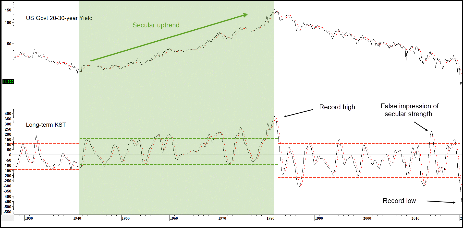
You can appreciate this from Chart 6 where the long-term smoothed momentum trades in a different band when in a bull market, (green shading) than during the two secular bears. Note that the extreme high 2014 reading looked more like a secular bull characteristic, as it suggested the long-term downtrend was in the process of reversing.
That didn’t transpire and the indicator subsequently sank to a record low in a similar but opposite manner to its record high at the 1981 secular peak. With rates not that much above zero, there should be a lot of support there, even though Europe and Japan have proved that it’s possible to go slightly negative. Since such turning points typically require a decade or so of base building, it’s likely that the actual signal will take place later, rather than sooner. Stay tuned.
Chart 6 — U.S. Bond Yields versus Long-term (KST) 1928 – 2020
Related Article: Long-term KST