
A secular trend is an extended price movement that embraces many different business cycles and averages between 15 to 20 years. It dominates the characteristics of the cyclical or primary trend that falls below it. The calendar year goes through four seasons; spring, summer, winter and fall and various phenomena are associated with each season, such as winter being the coldest. However, the seasons are not the same in all parts of the world. That’s because the weather is ultimately dominated by the climate. In the Dakotas, winter is extremely cold and long and summers are short, but in Florida winter is hardly felt and summers are hot and extended. Both areas of the country receive the same seasons, but their climates dictate the nature of those seasons. The same is true for the business cycle, since each one undergoes the same chronological sequence of events whatever the direction of the secular trend. However, the characteristics of each individual cycle differ, depending on the direction and maturity of the secular trend. Figure 1 overlays the secular trend on the cyclical. Note how the pro secular moves have much greater duration and magnitude than con seculars. That means that primary bear markets tend to be far more devastating in a secular bear than a secular bull.
The best approach to analyzing secular trend movements is to assume that they form over a long but indeterminate, as opposed to a predetermined period and are subject to the same trend determining techniques used in identifying reversals in any other trend.
Figure 1 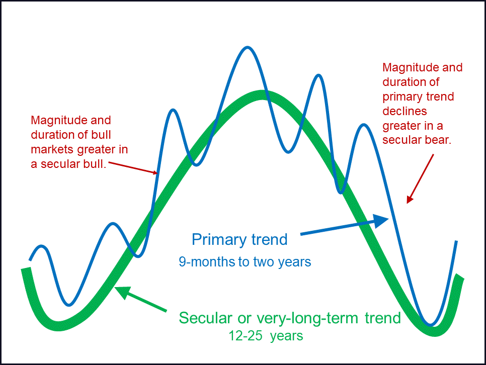
Chart 1 shows that since 1900 the US equity market has alternated between bullish and bearish secular trends which have averaged 14 and 18.5 years respectively. We’ll be concentrating on the secular equity bears here because of their challenging nature, secular bulls being a largely buy and hold environment. You may be saying to yourself that the 1900-1920 and 1966-82 periods were really trading ranges and therefore not bear markets. However, we’re only looking at part of the picture. For example, it’s possible to buy a stock at $10 and sell it for $20. That would imply a doubling of the original investment, but the real question should be what is the purchasing power of the proceeds when the stock is sold compared to when it was purchased? If the cost of living had doubled, there would be no gain.
Chart 1 — U.S. Stock Prices 1900 – 2018
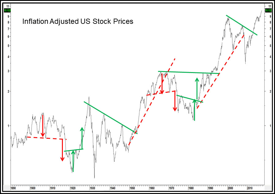
Chart 2 puts this in perspective because it shows the S&P deflated by the CPI. Now the trading ranges reflect their true bear market status. Two questions that might come to mind at this point are: What are the root causes of these secular bear trends? And how can the birth of a new secular bull market can be identified?
Causes of Secular Equity Bear Markets
There are probably three reasons why secular bear markets take place. They have their roots in psychology, structural economic problems and unusual volatility of commodity prices. The third factor is, to some extent an offshoot of the second. Let’s consider them in turn.
Psychological Causes
If you refer to Chart 2, you’ll see the Shiller Price Earnings Ratio in the bottom panel. This series uses a 10-year average of earnings adjusted for inflation to iron out cyclical fluctuations. We treat the P/E ratio more as a measure of sentiment than of fundamentals. For example, why were investors prepared to pay $30 for a dollar’s worth of earnings 1929? The answer was that they were projecting previous years of upward multiple revisions. Such a level of overvaluation clearly indicated an unusually high level of confidence. The P/E declined during successive secular bear markets to a low reading in the 7 to 8 area in 1949. Why? Because investors had watched inflation adjusted stocks decline for a couple of decades expected more of the same and wanted to be paid handsomely for the excessive risk that was generally perceived. In effect, sentiment typically reverses from exceptional optimism reflected by a high P/E to panic and despair at the secular low. The chart shows that the psychological pendulum is continually swinging from one extreme to the other. It indicates that a prerequisite for a sustainable new secular bull is a once in a generation mood of despondency and despair. Please note, that although the actual low developed in 1932, it wasn’t until 1949 that the P/E ratio was able to rally away from its oversold zone on a sustainable basis. That’s a principal reason why that particular secular bear is dated in such a way. Another is that the ratio between stocks and M2, which tracks secular movements well, also bottomed at around the same time.
These psychological swings associated with giant earnings contraction and expansion cycles are not just limited to P/E ratios. They also extend to other methods of valuation (sentiment), such as swings in the dividend yield on the S&P Composite from 2 to 3% at peaks to an average of 6 to 7% at secular lows. Replacement value for the whole stock market, as measured by the Tobin Q Ratio, typically swings from $1.00 to $1.15 at peaks to an average a discounted 30c on the dollar at secular lows. The same principles hold true. High valuations, whichever method is used, reflect optimism and careless decisions and low one’s fear and extreme pessimism, where investors demand to be paid handsomely for what the crowd thinks is a very risky environment.
Ironically, the actual level of inflation adjusted earnings when calculated as a 10-year moving average, actually rose during each of the twentieth century secular bear markets. Consequently, the more important influence on equity prices over long periods of time is investors’ attitude to those earnings rather than the earnings themselves.
Chart 2 — Deflated U.S. Equities and The Shiller PE 1900 – 2020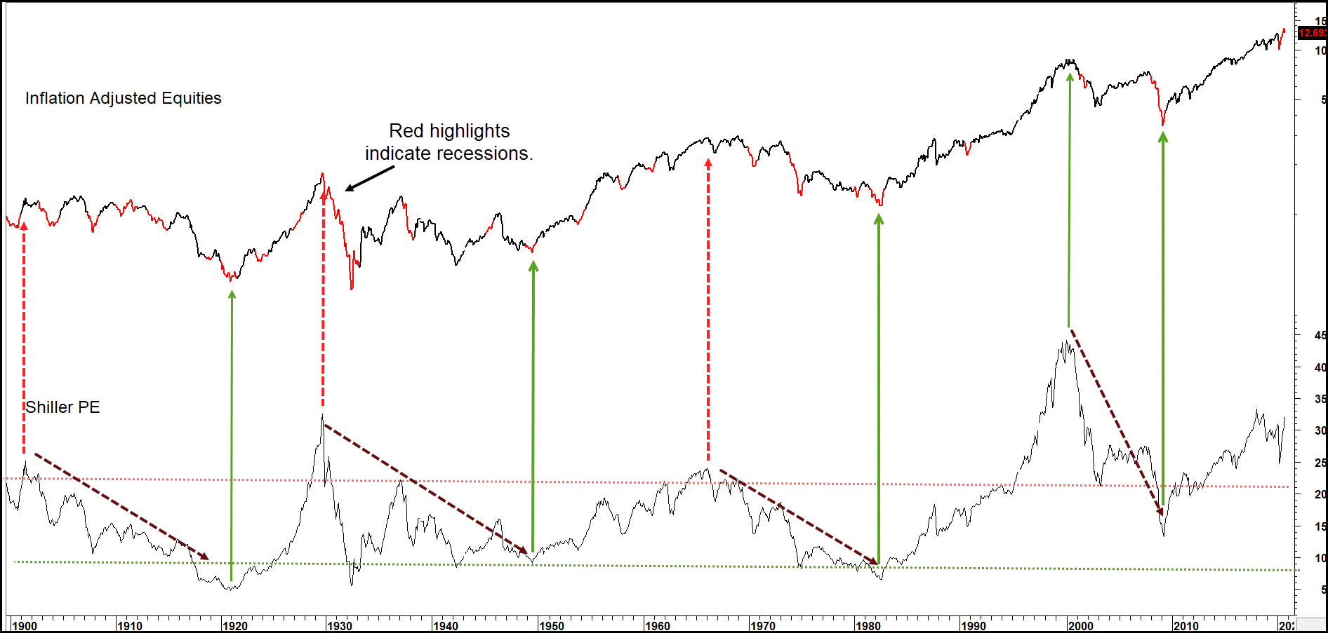
To understand the nature of secular price movements in equities, we need to take into consideration the fact that the longer a specific trend or condition exists, the more mentally ingrained it becomes. Investors are cautious at the start of a secular bull market because they’re mindful of the previous bear market. Eventually they gain confidence as each successive primary trend bull market rewards them. This process extends as investors gradually lower their guard, sooner or later falling victim to careless decisions as they are sucked in by their own success. They’re also egged on by an ever more optimistic crowd around them. In addition, due to the passage of time, new younger market participants arrive on the scene, investors who had no experience of the previous secular bear, and therefore no fear of another one. A common mantra, “this time it’s different” typically comes to the fore.
Structural Causes
The second cause of secular bear markets is structural. The secular peak is preceded by a decade or so, where a specific industry or economic sector gains in popularity. This results in a misallocation of capital as everyone wants a piece of the action and overbuilding results in excess capacity. In the early part of the nineteenth century the culprit was canals, in the 1870s it was railroads. Recently, we saw the dot.com bubble and later the housing bubbles. Such excesses usually take at least a couple of business cycles to unwind, but the pain that that involves gets the attention of governments, whose solutions compound the problem and drag out the secular bear. For example, the natural response to the 1930 downturn was to slap on tariffs to protect an overbuilt U.S. manufacturing industry and other governments around the world retaliated. It was worse than a zero-sum game because international trade spiraled on the downside, so everyone lost.
If evidence of structural deficiencies during secular downtrends is required, look no further than Chart 2 which catalogues the number of recessions experienced in previous secular bears. They number is between four and six, which compares to two in the 1949-66 secular bull and one in the 1982-2000 period. The 2000-2009 secular bear was an exception, but more than made up for the lack of recessions with the financial crisis. An economy that is continually experiencing periods of negative growth is clearly one cursed with structural challenges. Also, the repeated experience of recessionary behavior adds to the mood of psychological despair at the secular bear market low. By the same token, a lack of recessions or very mild ones that develop under the context of a secular bull market mean that primary trend bear markets are almost invariably brief and mild.
Chart 3 compares the Inflation Adjusted S&P Composite (spliced to the Cowles Commission Index prior to 1926) to the CRB Spot Raw Industrials (spliced to US wholesale prices prior to 1948). The chart flags the secular bear markets with the dashed red arrows. It’s fairly evident that all of them, with the exception of the 1929 to 1937 period, have been associated with a background of rising commodity prices. The relationship is not an exact tick by tick correlation, but the chart clearly demonstrates that a sustained trend of rising commodity prices sooner or later results in the demise of equities.
The thick solid arrows show that a sustained trend of falling or stable commodity prices is positive for equities as all secular bulls developed under such an environment. This point is also underscored by the opening decade of the last century. It’s labeled a secular bear, but real equity prices were initially quite stable as they were able to shrug off the gentle rise in commodities. Only when commodity prices accelerated to the upside a few years later did inflation-adjusted stock prices sell off sharply.
Chart 3 — Real Stock Prices and Secular Commodity Trends 1870 – 2020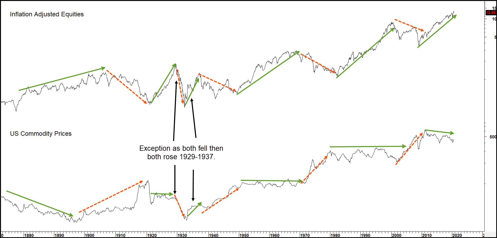
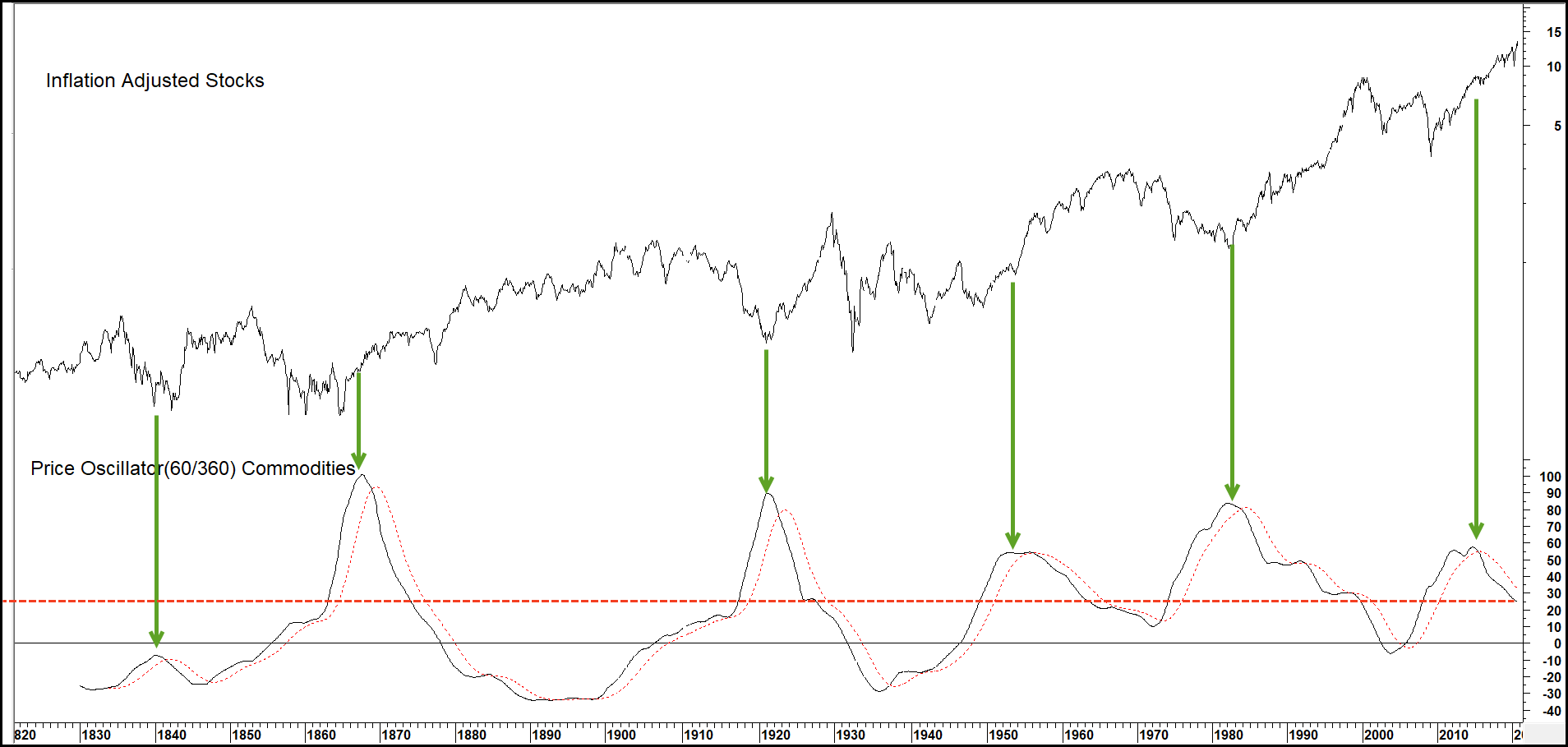
A useful approach for identifying a secular peak in commodity prices, and usually a secular low in equities, is to calculate a price oscillator or trend deviation measure for commodities. In this case, the parameters used in Chart 4 are a 60-month (5-year) simple moving average divided by a 360-month (30-year) average.
The green downward pointing arrows, indicating reversals from an overextended position, have offered six reliable buy signals for equities in the last 150 years or so. We’ll have to wait to see if the fourth such signal also pays off in a positive way. If nothing else, this chart demonstrates that dissipating long-term inflationary pressures are very positive for equities.
Chart 4 — Inflation Adjusted Stock Prices versus Commodity Price Momentum 1820 – 2020
Techniques that Help Determine the Direction of Secular Trends
Background
When we’re trying to spot changes in primary trends associated with the business cycle, it’s occasionally possible to identify reversal signals that take place within a matter of a couple of months of the final turning point. Secular trends extend over many business cycles and therefore are much longer in duration. This means it may take many years or even several business cycles before a reversal signal can be identified. However, the patience and discipline required to track down these changes are well worth the trouble. First, these signals don’t develop very often and are likely to remain in force for one or more decades. Second, the direction of the secular trend has a huge influence on the character of the primary trend. Bull markets in secular uptrends last on average much longer than bull markets in downtrends and so forth. Understanding the direction of the secular trend can put us streets ahead in the process of allocating assets around the business cycle.
One problem we face is that the recorded history of US financial markets doesn’t go back very far when we consider that a secular trend often extends for 25 years or more. This means there aren’t that many data points that can be considered. All we can do is apply some of the trend following principles and tools that might be used for identifying reversals in shorter-term price movements and seeing how well they work. Specifically, we’ve found that momentum offers the most accurate and timely signals when confirmed by trendline breaks whereas moving average analysis plays a less substantive role.
Identifying Secular Equity Trend Reversals
The average secular equity bull market between 1900 and 2020 has lasted 14 years compared to 16.7 for bear markets. If the 1921-29 bull market outlier is ignored, the average length just over 17 years is more in line with the average secular bear. Once a new secular trend has been identified, one starting point is to relate the time that has already elapsed to the average in order to see how much that trend may be expected to extend into the future. Another benchmark would be the Shiller P/E ratio to see where it stands relative to its extreme overstretched lines. That approach though would have been problematic in the post 2000 era due to the consistently elevated readings.
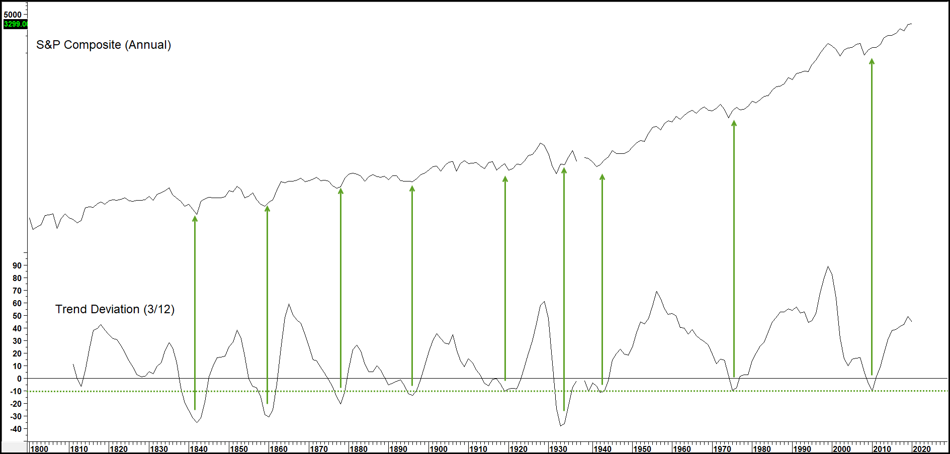
Charts 5 and 6 compare the US stock prices to a price oscillator using a 3-year MA divided by a 12-year span. Since annual data is being used, precise timing shouldn’t be expected, but the peaks and troughs in this indicator nevertheless do offer some useful benchmarks of the market’s long-term temperature. Secular accumulation points are indicated in Chart 5 when the oscillator bottoms out from at or below the –10% level. Only one of the seven signals since 1800 has proved to be a whipsaw and that was the one given in the late 1930s. So far, the 2012 signal has turned out to be valid as the market rallied between then and 2020.
Chart 5 — U.S. Stock Prices and Buy Signals from a Secular Price Oscillator 1800 – 2020
Since markets spend more time rising than falling, the negative signaling benchmark has been raised from 10% to 40%. In this exercise, peaks are signaled when the oscillator crosses below the +40% level and flagged with the downward pointing arrows. The actual market peak is often signaled when the oscillator reverses direction, meaning the negative overbought crossover is a more conservative approach. In some instances, these peaks are followed by multi-year trading ranges rather than actual declines. However, in all instances except the early 1960s sell signal, nominal prices had a hard time advancing for quite a while after the signal was given.
Chart 6 — U.S. Stock Prices and Sell Signals from a Secular Price Oscillator 1800 – 2020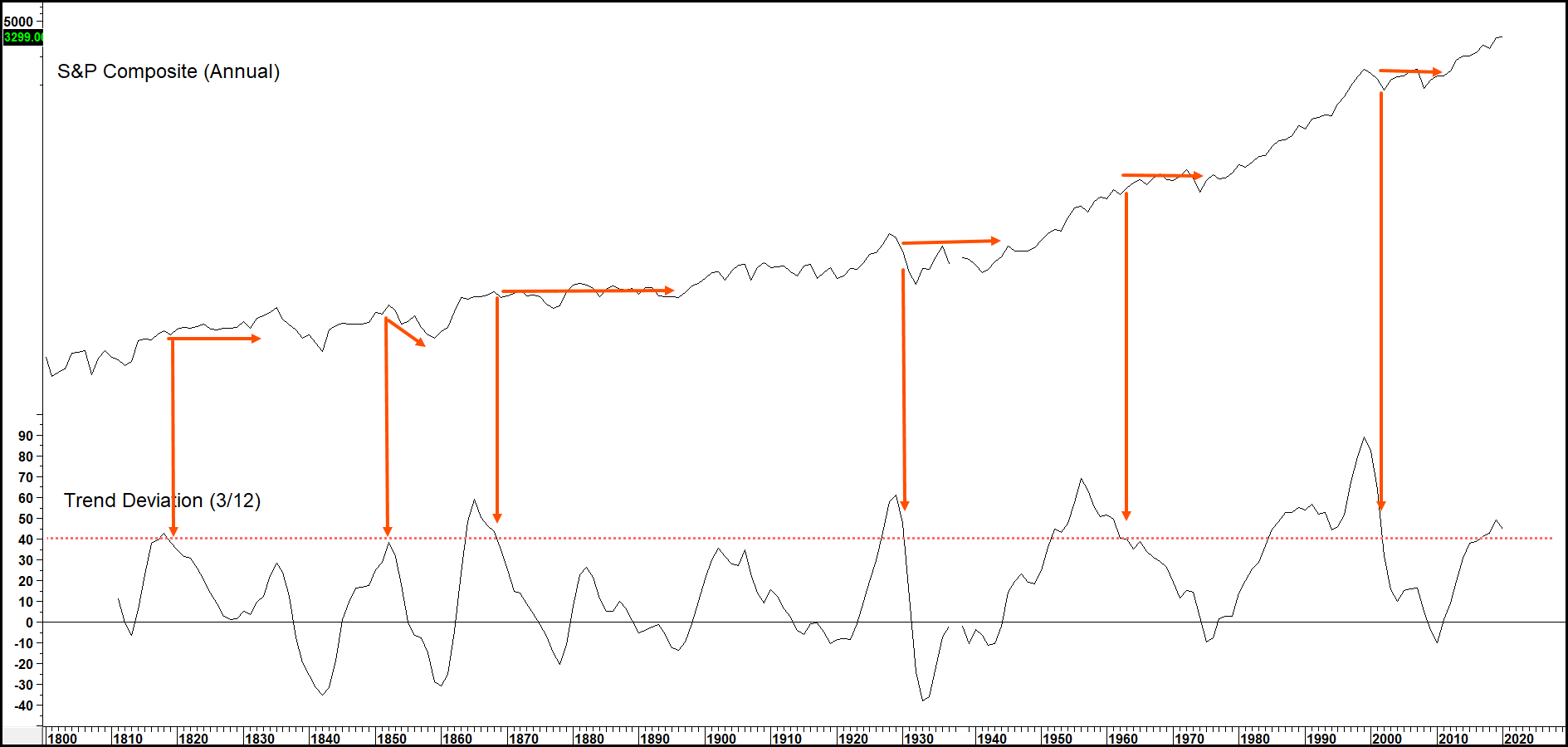
Trendlines are often a very useful secular identification tool. Chart 7 shows how trendline violations or price pattern completions have reliably signaled major reversals over the last 100 years or so. The problem of course is that it’s not always possible to construct lines against fast markets, such as the 1929 – 32 drop. Alternatively, lines can be constructed but their violation comes well after the turning point.
Chart 7 — Inflation Adjusted Stocks Using Trendlines for Secular Reversals 1890 – 2020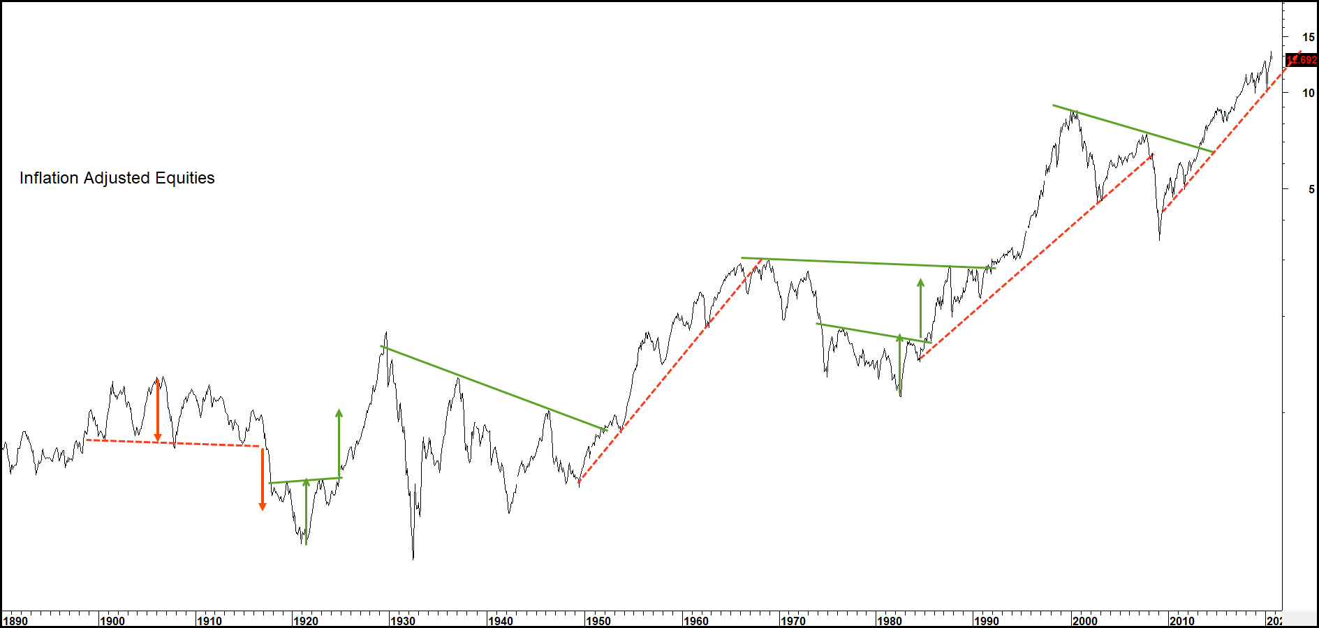
An alternative is to combine trendline violations with an oscillator. In this case, a useful secular span is to divide a 60-month (5-year) by a 360-month (30-year) moving average, as shown in Chart 8. Apart from the disastrous 1930s signals contained in the ellipse, when every signal developed completely out of kilter with the price, this approach worked well in the 1900-2020 period.
Chart 8 — Inflation Adjusted U.S. Stocks and a Secular Price Oscillator 1830 – 2020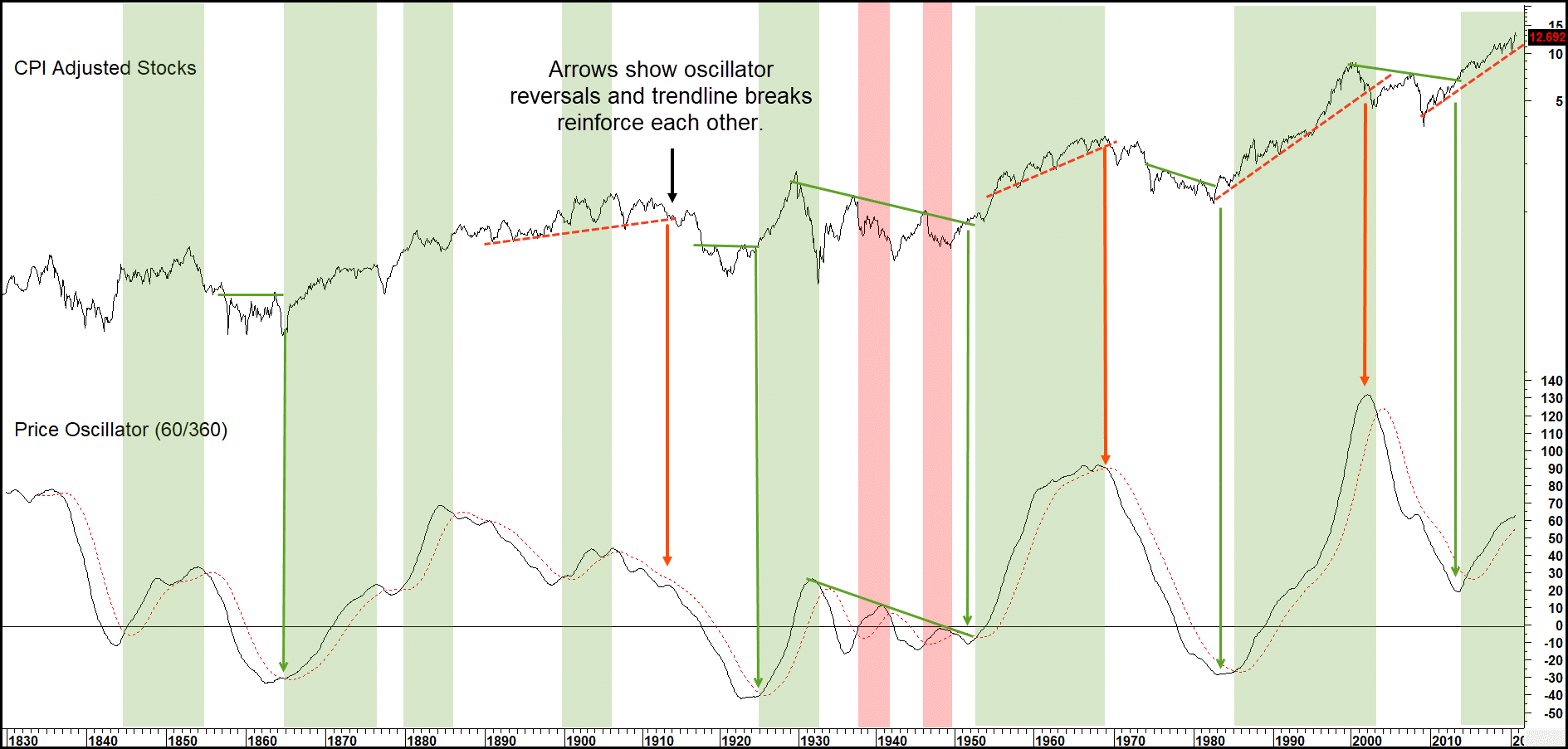
Summary
- Since the nineteenth century, stocks have alternated between secular bull and bear markets generally lasting about 15 to 20 years.
- Secular bear markets for stocks are determined by long-term psychological swings. They’re influenced by structural economic problems and unusually volatile commodity prices.
- Secular trends can be analyzed with regular technical techniques such as momentum, trendline and moving average analysis.
- Surprises typically come in the direction of the secular trend, which determines the characteristics of the primary or business cycle associated trends.
Related Article: Secular Trends of Commodity Prices