
History shows that commodity prices regularly undergo very long-term swings in price extending over a couple of decades or so. We call these secular trends. It’s difficult to pinpoint a specific cause of secular commodity bull markets as they appear to emanate from a combination of structural imbalances, wars and liquidity provided by central banks to offset these problems. Long-term uptrends in commodity prices also embolden producers to expand capacity leading to overbuilding at, or just after, secular peaks. Secular bear markets evolve as this oversupply situation is gradually worked off. Psychology also plays a part in that monetary velocity greatly affects the inflationary ability of any given dollar of liquidity in the system. Suffice to say, these factors integrate in such a way that it’s possible to observe clear-cut secular trends in commodity prices.
Chart 1 shows an historical perspective back to the early nineteenth century. You can see that, excluding the rising trend that began in 2001, the average secular bull market lasted 19 years and the average bear 22 years for an overall average of around 20 years. Some of these “bear” markets were really trading ranges as the 1950s and 1960s as the 1980-2001 periods testify.
Chart 1 — Industrial Commodity Prices 1840 – 2017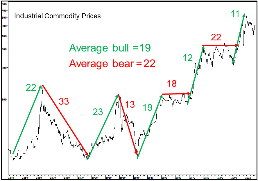
Identifying Secular Commodity Trend Reversals
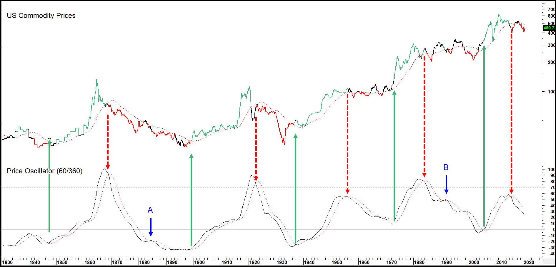
One method is to adopt a 60-month/360-month price oscillator. This is shown in Chart 2 where 48-month MA crossovers of the oscillator are used as momentum buy sell alerts. Notice the two arrows at A and B, which indicate the only whipsaws in nearly 200 years of history. Okay, a couple of the signals were late but not a bad overall performance. Using that approach would call for a secular peak in 2011, followed by a secular bear or trading range of unknown magnitude or duration. The green highlights tell us when the oscillator is bullish and this is confirmed by the Index crossing above its displaced 96-month MA. Red highlights are generated in the opposite way, and black appears when there’s a conflict between the oscillator and the Index.
Chart 2 — Industrial Commodity Prices and a Long-term Price Oscillator 1830 – 2020
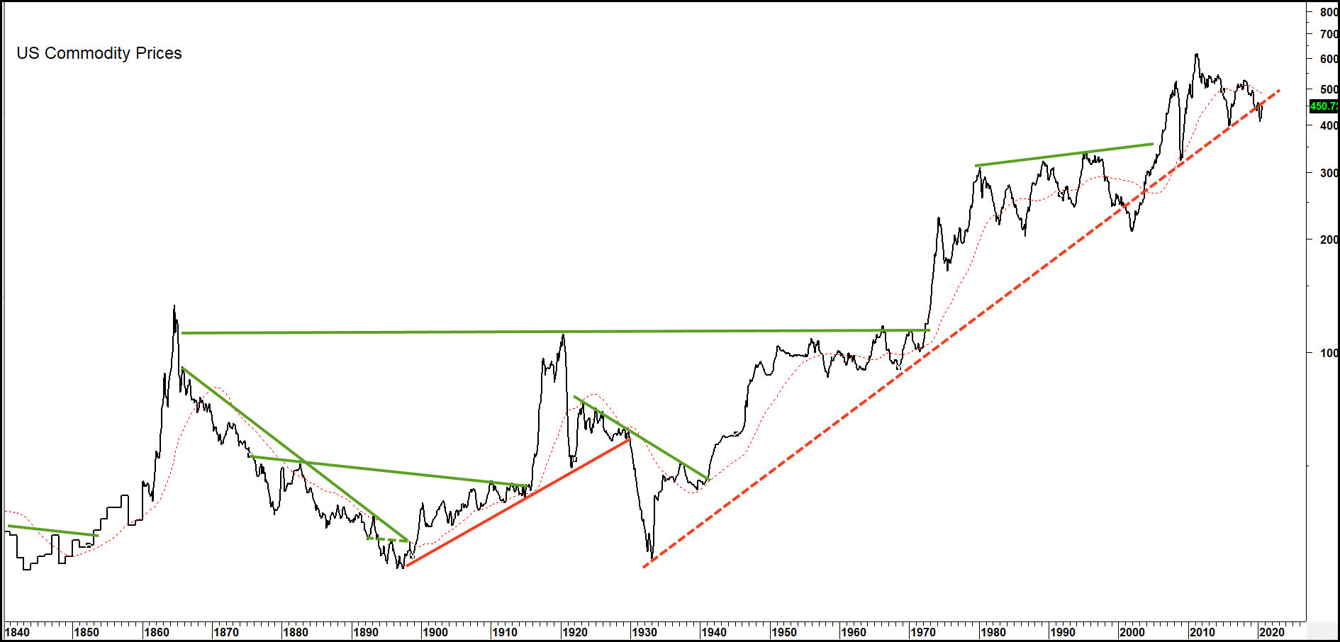
Trendline analysis can also be adopted for commodity prices. Some examples are shown in Chart 3. Note the dashed up trendline that has its roots in the 1930s. If it’s ever seriously violated, expect to see a major commodity decline or extended trading range follow.
Chart 3 — U.S. Commodity Prices 1840 – 2020
Primary Trend Characteristics Change with the Direction of the Secular Trend
History shows us that the direction of a secular trend influences the characteristics of the primary trends that fall under it. During a secular bull, primary bulls tend to have much greater magnitude and duration than those that develop under the context of a secular bear. The former is a pro trend move, the latter a contra trend one.
Chart 4 substitutes a 15-month rate of change (ROC) of the CRB Spot Raw Industrials as a proxy for these primary trend moves. The raw industrials are used because of two factors. First it avoids the use of weather driven commodities, with the exception of cotton, which makes the Index much more responsive to economic conditions than more broadly based series such as the CRB Composite or DB Commodity ETF (DBC). Since the commodities contained in the Index are solely traded by commercials, they’re less subject to speculation. The pink shaded areas in the chart represent an objective method of assessing the bearish secular trends. That’s because they approximate periods when the oscillator, featured in Chart 2, was in a declining mode. The first thing to notice is that the four secular peaks prior to 2011 were signaled by the ROC reversing from at or above the (dashed) red horizontal line at +55%. Second, on most occasions when this indicator has fallen to or below the deeply oversold blue dashed line at -25%, the secular trend was bearish; that was the case in 2016. There were two exceptions at points A and B but these developed as shakeout moves following a strong advance when the oscillator was in a bullish mode. Third, the behavior of the ROC under a secular bear market environment is also revealing. That’s because counter-cyclical rallies have generally been unable to record readings much above the +30% barrier. When they did, the initial upside penetration signaled that for all intents and purposes, the advance was over. These instances have been flagged by the six thick red arrows. The thin red ones tell us that in most situations ROC rallies amount to very little in terms of magnitude when the secular trend is bearish.
Chart 4 — CRB Spot Raw Industrials versus a 15-month Rate of Change 1860 – 2020
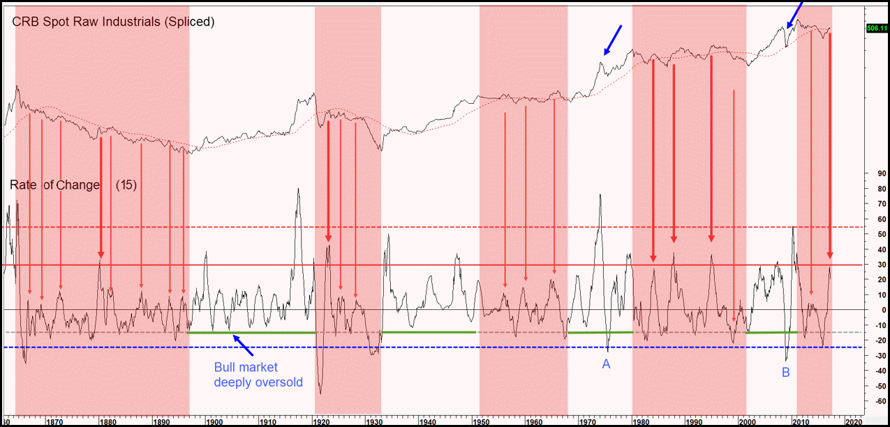
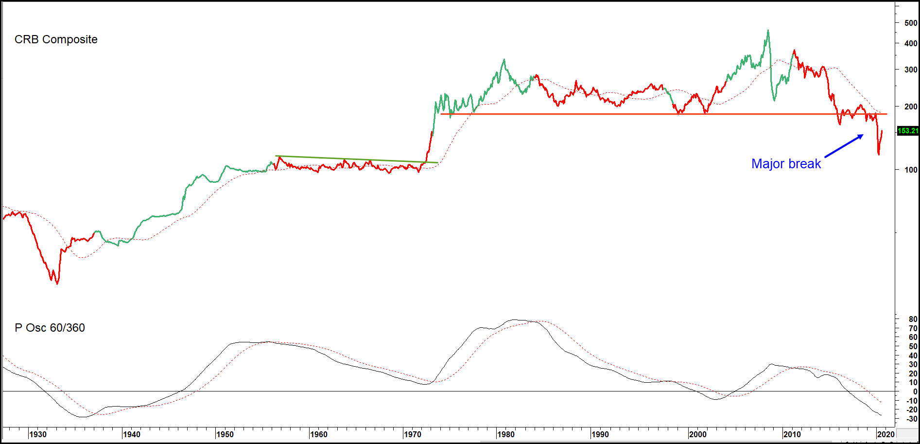
Chart 5 tends to confirm that idea as a similar oscillator for the more broadly based CRB Composite is also in a declining mode. The Index itself violated a multi-decade support trendline which has now reversed its role to one of resistance. As the chart closes, it looks like the Index may have begun a new primary bull market. With the displaced 50-month MA and trendline at 185, it seems that a month-end reading above 200 would offer one piece of evidence that a new secular bull market is underway.
Chart 5 — CRB Composite versus a Secular Price Oscillator 1927 – 2020
Related Article: Secular Trends in Bond Yields and Prices