
Traditionally, the level of dividend yield on the S&P Composite has been used to gauge whether the market is over or under valued. Historically, yields below 3% were regarded as expensive, whereas those in the 5 to 6% range typically develop at bear market lows. Between the early 1990s and 2020, when this article went to press, anyone relying on this approach would have remained underexposed during some of the best bull markets in history. This outlier period has been flagged by the gray shading in Chart 1. Note, the yield has been plotted inversely in all the charts featured here to correspond with swings in equity prices.
Chart 1 — S&P Composite versus the Inverted Dividend Yield 1955 – 2017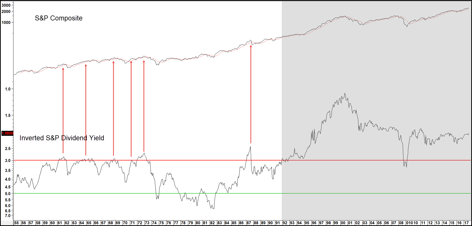
A better timing approach seems to come when the dividend yield is calculated as a long-term smoothed momentum indicator, specifically its KST. We can take this approach back to the late nineteenth century as shown in Charts 2 through 4. The shaded areas approximate when the KST, which you can read about here, crosses below its MA.
It captures virtually every bear market that developed in the period covered by these three charts. In some instances, flagged by the upward slanting blue arrows, we find false negatives, which is why a technique such as this requires confirmation from a trend reversal signal in the S&P itself. That could, for instance, be a negative 12- or 24-month MA crossover. Note also, that most of the false negatives developed under the context of the 1982-2000 and 2009 -?? secular, or very long-term, bull markets.
Chart 2 — S&P Composite versus the Inverted Dividend Yield Momentum 1875 – 1944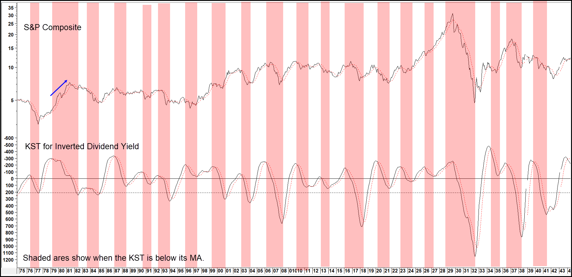
Chart 3 — S&P Composite versus the Inverted Dividend Yield Momentum 1944 – 1980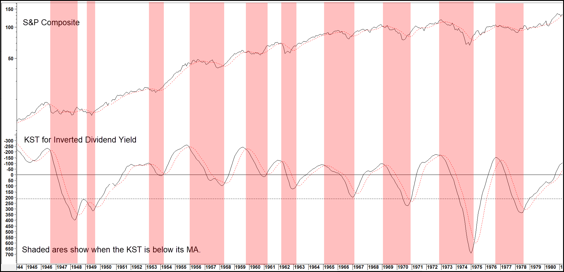
Also, the white areas of these charts are usually associated with a cyclical bull market, where the worst that happens is an intermediate decline of some kind. In other words, when the (Inverted) KST is rising and above its 9-month MA, it’s usually an excellent time to own stocks.
You can download the dividend yield from 1870, as well as other selected data, including the Shiller P/E from the Robert Shiller site.
Chart 4 — S&P Composite versus the Inverted Dividend Yield Momentum 1981 – 2020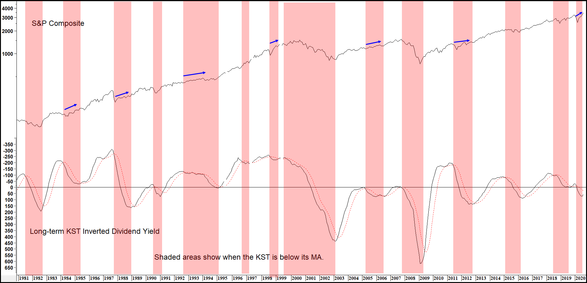
Related Article: Long-term KST