
No one indicator will ever perfectly identify every major turning point for bond prices or yields. If we incorporate several series that have been reasonably consistent over a long period of time though, it is possible to obtain more consistent results. It’s also important to back test over many decades incorporating periods of inflation, deflation and crises in order to end up with a robust end product. We call this consensus indicator the Bond Barometer. It comprises four components. Two are trend driven. The remainder are derived from inter asset relationships including, the trend of industrial commodity prices. The latter are included because their swings greatly influence bond yields.
This model is designed to identify primary trend reversals in the credit markets. Primary trends are defined as lasting approximating 1 to 2 years. Their principal driving force are changes in business cycle conditions. The Barometer has a score that ranges between 0 and 100%. Based on a 2-month MA, a reading of 50% or higher is bullish and below 50% is bearish Charts 1 and 2 compare the progress of the iShares 20+ Year Treasury Bond ETF (TLT) to the Bond Barometer since the mid 1950s. The red highlights approximate the bearish periods when this model experienced a reading of less than 50%. Green reflects bullish readings of 50% or greater. We use it to signal primary trend reversals in long-term (20-year) government and corporate AAA yields. Please note that data for the TLT only goes back to its listing in the fall of 2002. Consequently, the series in Charts 1 and 2 prior to that date are taken from the price of a simulated 20-year government bond series.
Chart 1 — Barclays 20-year Trust (TLT) versus the Bond Barometer 1955 – 1986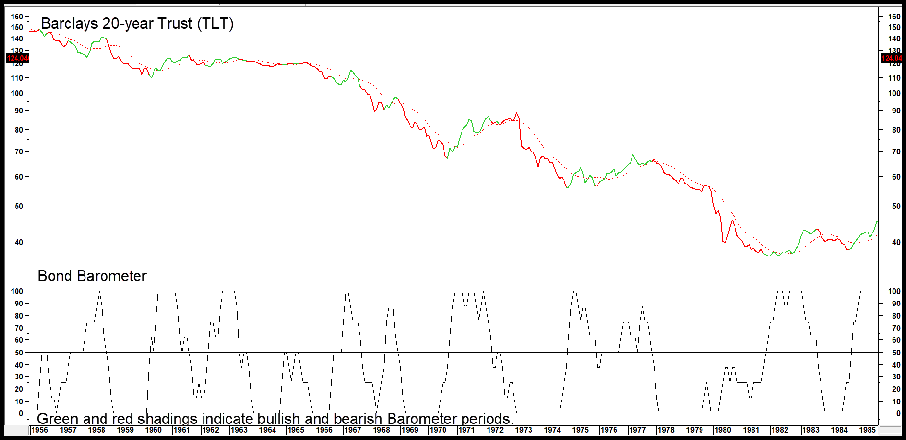
The two charts between them cover part of the 1946-81 secular downtrend in prices and the subsequent 36-year secular uptrend in prices. The word secular in this sense, covers the very long-term trend embracing many business cycles. The principal implication for cyclical (primary or business cycle associated trends) is that those which operate in the same direction as the secular trend tend to have greater magnitude and duration. For example, in Chart 1 the green (counter secular) buy signals are far less powerful than their red (pro secular) sell signals. That distinction is less evident in the secular uptrend that started in 1981 as the choppy action since the beginning of this century, limits the scope of the various buy signals.
Chart 2 — Barclays 20-year Trust (TLT) versus the Bond Barometer 1981 – 2020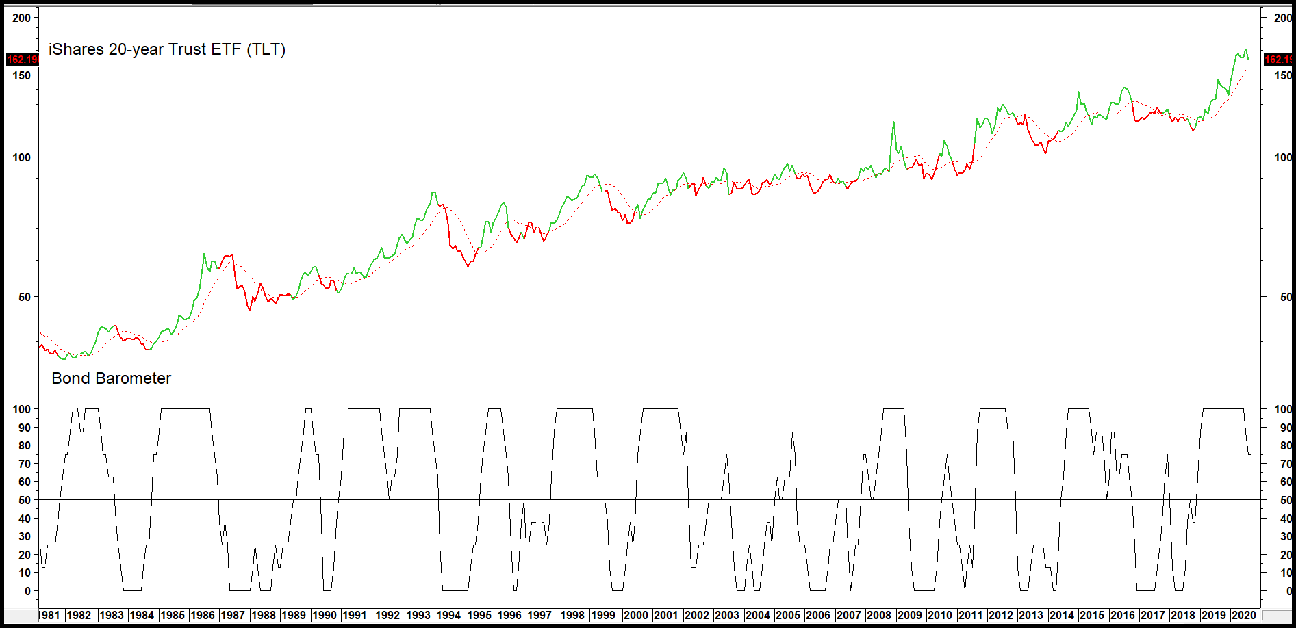
The Barometer’s Primary Objective
The first objective in any investment situation, is to preserve capital. That is also a primary purpose of the Bond Barometer. If you look at Chart 1, which reflects the secular drop in bond prices (rise in yields) between the 1940s and 1981, you can appreciate how great the losses would have been for anyone adopting the buy/hold approach. One of the underpinnings of this model is to take a conservative approach by protecting the investor from any serious long-term decline. A quick glance at Chart 1 shows the Barometer did a fairly good job of avoiding most of the bear markets. The price decline in 1967 was an exception. By and large though, this model would have allowed the investor to reap most of the bull market gains, yet offer protection from the majority of the bear markets.
The period between 1981 and 2005 was much easier to play from the long side since the secular trend of rising prices enabled some pretty good returns to be attained. The main criticism one could lay during these two decades is that there were several instances of whipsaw activity where the Barometer kept changing its mind.
Related Articles: Government/Baa Credit Spread and its Effect on Bond Yields, Stock Barometer