
The Total Return (TR) model compares the total return performance of the S& P Composite to that for cash (3-month commercial paper yield). When the return on stocks is greater than that of cash, the model is said to be bullish. It then earns a green highlight on the accompanying two charts. When cash offers the superior return, this is negative for stocks and the highlight is relegated to red.
The model is calculated by taking a 10-month ROC of the S&P and adding it to the dividend yield. The commercial paper yield is then subtracted from this total and the result is the Total Return Indicator. It’s bullish when this series is above zero, bearish when below.
Chart 1 — S&P Composite versus the Total Return Model 1900 – 1969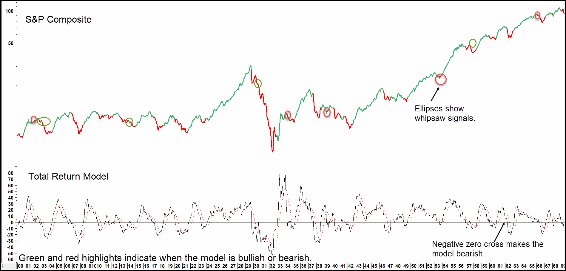
The two charts split the performance of this model into two periods, that prior to and after 1969. The good news is that the model keeps an investor exposed to the market during pretty well all of the bullish periods in the 120 years covered by the charts. More importantly, it sidesteps the worst the bear markets.
No indicator is perfect, and the TR model is no exception. In this respect, the ellipses in both charts flag false or whipsaw signals from both a bearish and bullish aspect. However, this seems to be a small price to pay for the insurance of avoiding the vast majority of the 1929-1932 and 2000-2009 bear markets.
Chart 2 — S&P Composite versus the Total Return Model 1969 – 2020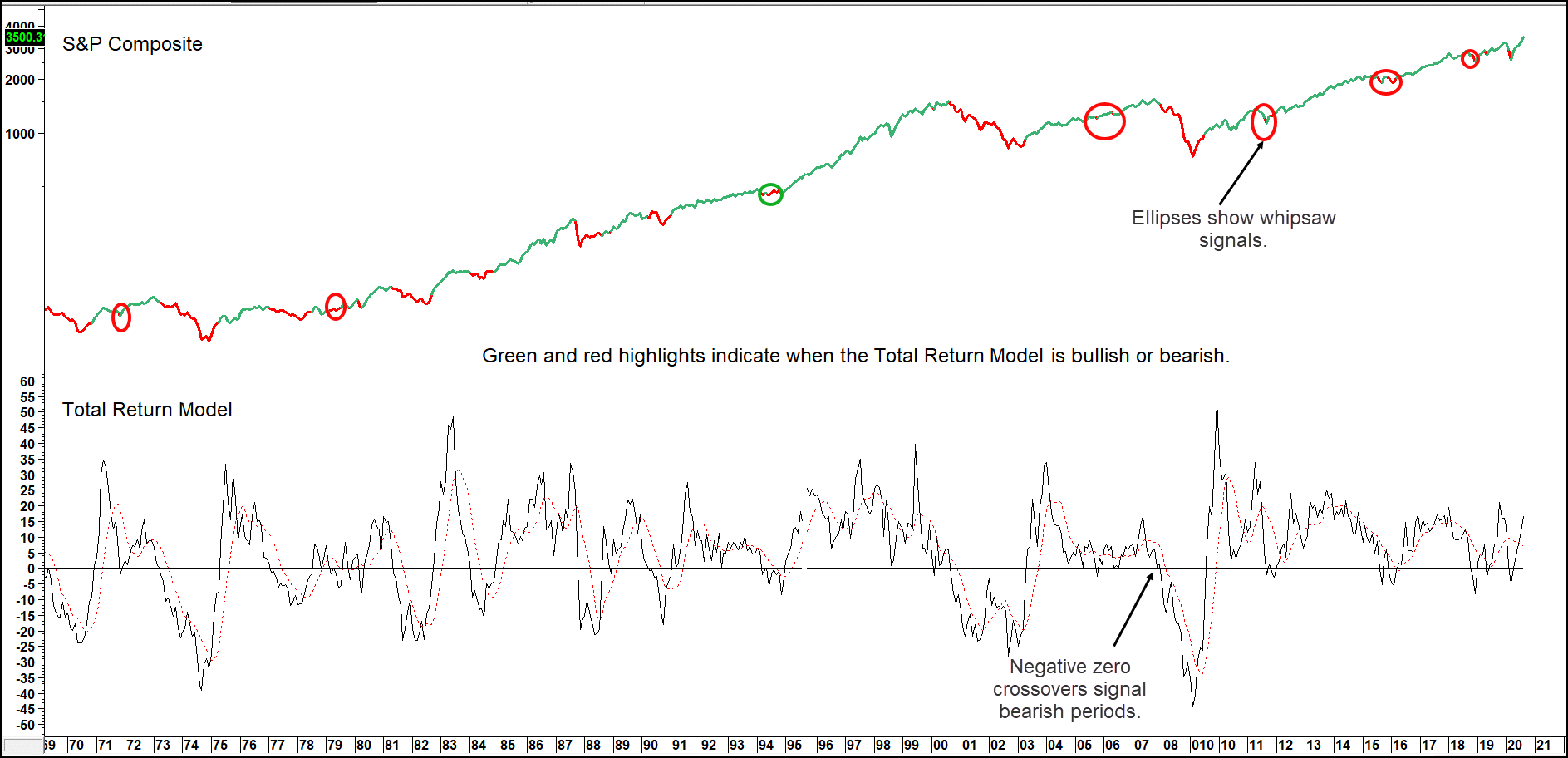
Related Article: Stock Barometer