
In Part I of this article, we pointed out that the business cycle is nothing more or less than a set series of chronological sequences and that the primary turning points for bonds, stocks and commodities are part of this structure. Since there are three markets and all have two turning points, a typical cycle consists of Six Stages or seasons. Each favors an emphasis of certain asset classes and avoidance of others.
Figure 1 shows an idealized cycle, where the six stages of the business cycle have been identified. Stage I occurs when interest rates peak out; i.e., debt prices turn bullish, but stocks and commodities are still declining. Stage II is signaled when stocks join bonds in the bullish camp and Stage III when all three markets are in uptrends. The fourth phase of the cycle develops when bond prices peak and the fifth, following a topping in the stock market. Finally, Stage VI arrives when the commodity bull market has run its course. The blue bars at the foot of the diagram indicate that each market has three positive phases. For instance, Stage I, with a weak economy, is bullish solely for bonds and interest sensitive stocks. Stage V, on the other hand, reflects tighter capacity constraints, which favors commodities and commodity sensitive stocks. During economic slowdowns, when the growth path slows but never really contracts, the chronological sequence of market turning points still operates. The principal difference is that the magnitude and duration of the cycle’s “down” part is far less volatile than a typical recession. It also means that the chronological sequence of financial market turning points have a tendency to speed up.
Figure 1 — The Six Stages of the Business Cycle
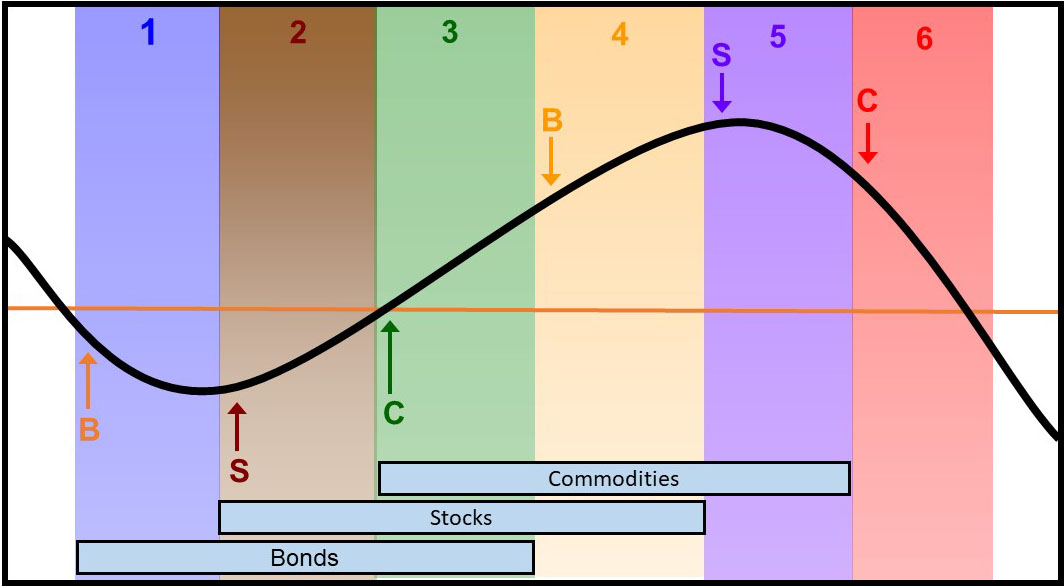
It’s important to note that the figure reflects an idealized cycle where each stage has an identical duration. In reality, that’s not the case because the leads and lags vary with the makeup of each cycle. Moreover, stages can develop out of sequence or can even be skipped. We have learned that it’s better to use this approach as one that tries to define the environment, rather than assuming a pre-determined chronological sequence. In other words, don’t dogmatically expect the cycle to progress in the expected way. Instead, ask the question; Are the markets behaving consistently with what I believe to be the current stage? For example, if the analysis indicates a Stage I, where the economy is weak, bonds are rallying, commodities are dropping and defensive equities outperforming, then go with that analysis. If the markets are behaving differently, then it’s probably not a Stage I. We call this process “trust but verify”.
From an asset allocation point of view, doesn’t it make sense to reduce your exposure to stocks in anticipation of a recession and to purchase more stocks when the economy is expected to accelerate into a growth mode? For instance, during a Stage 1 recessionary or slowdown environment, our asset allocation guideline (see Figure 2) includes a healthy mix of bonds and cash to stabilize portfolios.
Figure 2 — Broad Based Cycle Asset Allocations Guideline
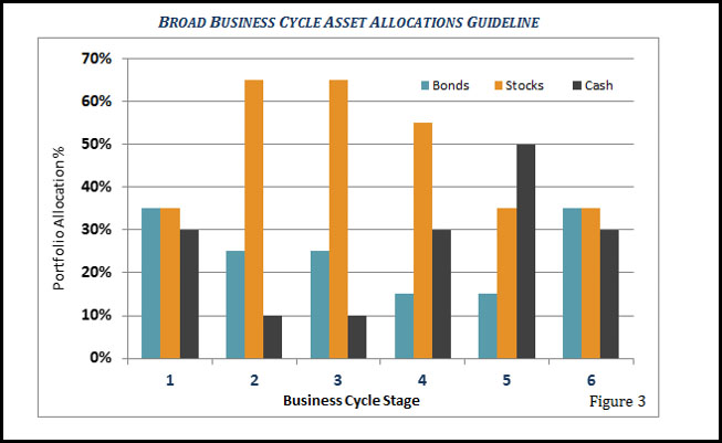
The opposite is true in Stages II and III, when the economy is moving up to full throttle. At that time, maximum exposure to stocks is recommended. We believe that our six-stage framework is an ideal way to construct an active allocation discipline, especially because it also serves as a critical risk management tool. Next, it’s important to answer the question: How are these stages or environments identified?
Identifying the Stages Using Moving Averages
We have created models or barometers for the three markets, using their status to determine the stages. If all three are bullish, that’s a Stage III. Alternatively, if only commodities are bullish, that combination signals Stage V and so forth. For those who do not subscribe to the InterMarket Review, where the models are updated monthly, there are two other ways that help in stage identification.
The first is a very simple technical approach of comparing each market with its 12-month moving average. The proxies we employ are long-term government bond prices, the S&P Composite, and the CRB Raw Industrial Commodity Index. Raw industrial commodity prices are used because they better reflect changing conditions in the business cycle. Where data is not available for the Spot Raw Materials, the CRB Composite can be substituted.
When a market is above its average, it’s considered to be bullish and vice versa. There is no moving average time span that can be expected to work perfectly over all markets at all times. However, the 12-month span though, seems to test better than most. Even so, it does occasionally trigger whipsaw signals. Using this approach also means that stages occasionally move out of sequence. Even so, the position of these markets relative to their MAs is still valuable information to have. First, it provides guidance concerning the current nature of the overall investment environment. Stage II is still bullish for stocks whether you get there from Stage I or III. Second, this approach has made money through periods of war, peace, inflation, deflation and financial crises. The results have been summarized in Table I.
Table 1 — 1900 – 2011 Total Return Asset Performance by Stage
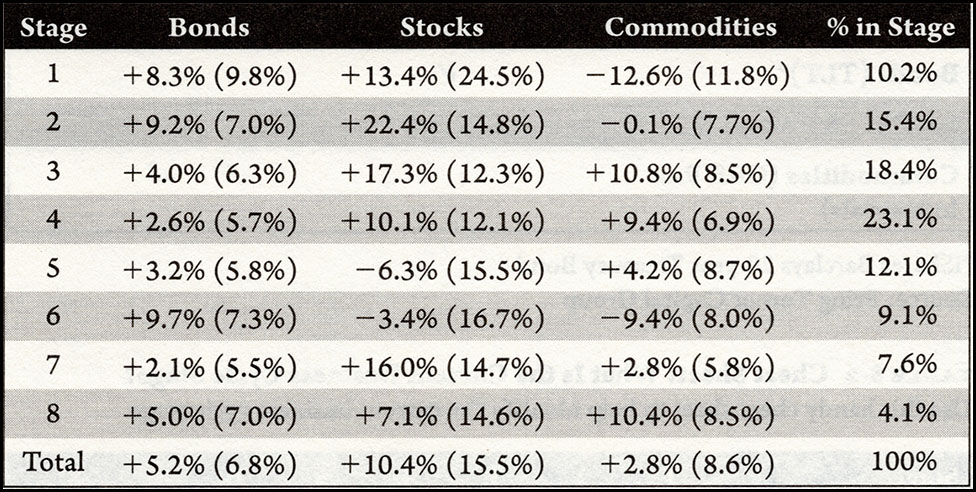
The numbers expressed here represent the average monthly returns on an annualized basis for all those months where the various markets experienced a specific stage. Thus, the top left hand 8.3% means that for all the months classified as a Stage I, bonds returned 8.3% on a price basis. The first thing to notice is that they perform well exactly when we would expect them to, in deflationary Stages I, II and III. Surprisingly, there is a strong gain in “bearish” Stage VI. That’s because prices typically bottom in an abrupt fashion. With the benefit of hindsight, we can see that the actual phase is Stage I, but the official Stage I is not confirmed until the average is actually surpassed on the upside. Stocks also perform as expected, with gains in Stages II, III and IV. They also unexpectedly make money in Stage I for the same reason that bonds do in Stage VI. Commodities are profitable where projected, in Stages III, IV and V. They lose as expected, in Stages I, II and VI.
It’s also apparent from the table that the system occasionally finds itself in an unclassifiable phase, where stocks are bullish, but bonds and commodities bearish. We call that Stage VII. The other unclassified phase, Stage VIII develops when we see the opposite to VII with stocks as the solely bearish market. Fortunately, research demonstrates that these two rogue stages combined exist less than 12% of the time.
Identifying the Stages Using Inter-Asset Momentum
Adopting the 12-month MA approach is certainly useful, but we shouldn’t lose sight of the importance of gaining a better understanding of the prevailing investment environment. Our vehicle for this comes from inter-asset relationships. Since the relationships themselves can be fairly jagged and therefore subject to whipsaws, we prefer to use their smoothed long-term momentum.
There are multiple possibilities, but this exercise will be limited to the buying points for each of the three markets; Stage I for bonds, Stage II for equities and Stage III for commodities. If it’s concluded that the current environment is reflective of Stage I, then several characteristics should be present. Bonds should be rallying, and stocks and commodities falling. One way of expressing that is to calculate a long-term smoothed momentum curve (KST) for the ratio between bonds and commodities, as shown in Chart 1.
The KST formula is featured here. If your software doesn’t plot this indicator, it’s possible to substitute the MACD. A rising line is deflationary and favors bonds and a declining one inflationary when commodities are outperforming. As bond/commodity momentum bottoms, a green arrow is generated. Pretty well all situations are followed by some kind of a bond bull market. There have been sixteen upside reversals since 1960. Ten of those signals were triggered when our models, cited earlier, were signaling a deflationary Stage I or VI.
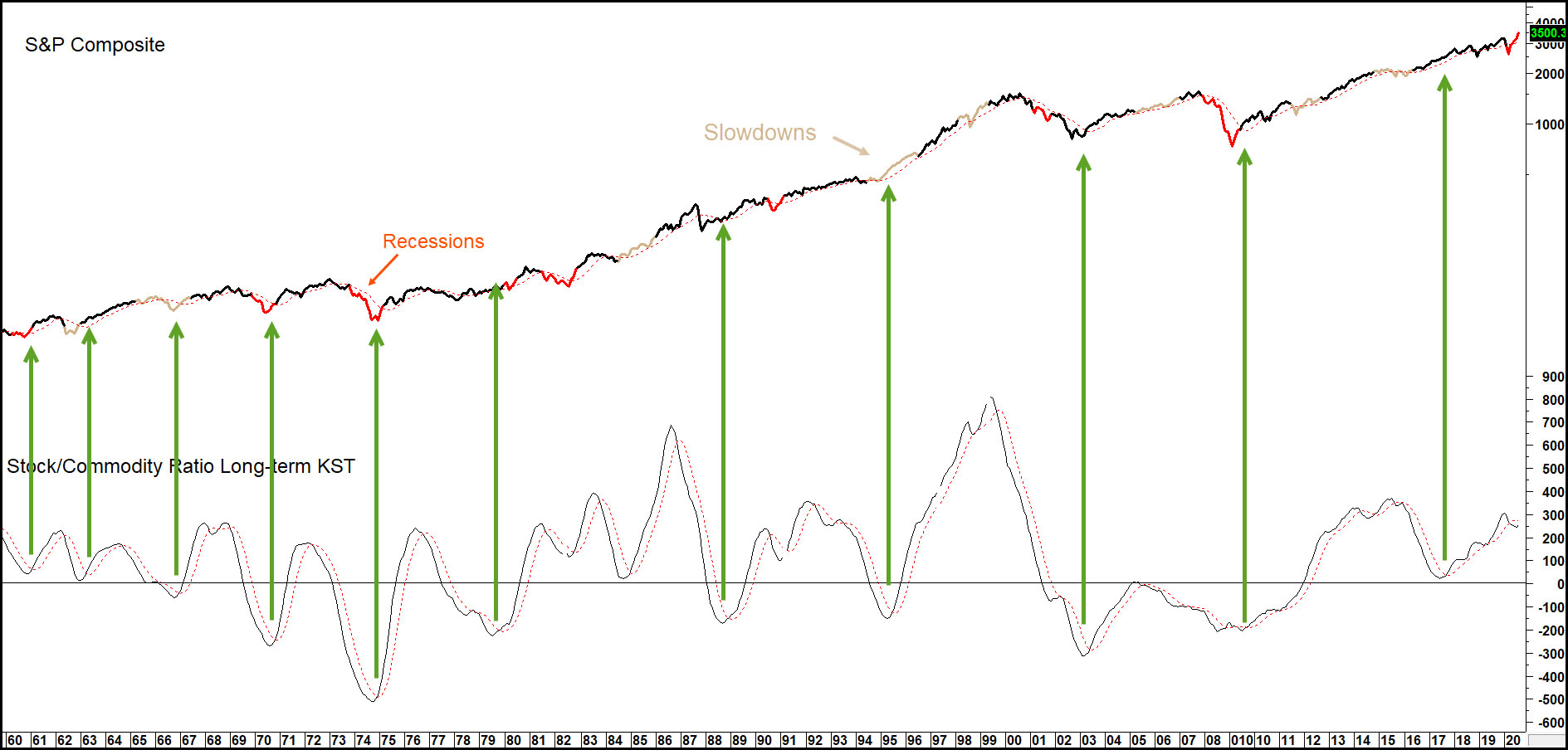
Stage II is exemplified by the birth of an equity bull market, as stocks anticipate the next recovery. The equity bear market had been characterized by stocks falling at a faster rate than commodities, so when stock/commodity momentum bottoms, that tells us that a new bullish phase for equities has begun.
Chart 1 — iShares 20+ Year Treasury Bond ETF (TLT) versus the Bond/Commodity Ratio Long-term KST
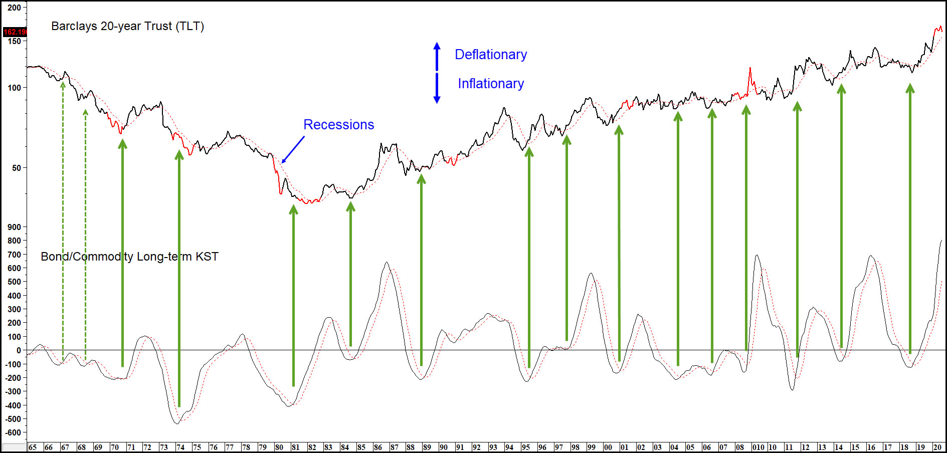
Chart 2 shows that such an event typically offers a great buying opportunity. Once again, the green arrows indicate these upside reversals. Note that the vast majority occurred when the economy was in the mid-to late stage of a recession, typical of a Stage II when economic momentum is close to its low point. About half those KST reversals developed when our models were in a Stage II.
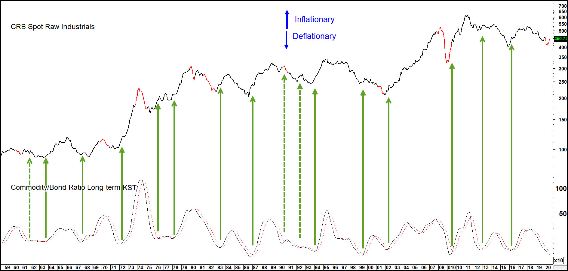
Commodities bottom in Stage III, so it’s useful to look at the relationship between commodities and bonds. A rising KST is inflationary because commodities are out-performing bonds, whereas a declining one is deflationary. The arrows show that upside reversals in the KST have typically been followed by a nice commodity rally, as the cycle transitions to its inflationary part. There was one exception in 1990, which was quickly reversed. These turning points suggest a Stage III environment because most of those green arrows are triggered close to the ending of a red recession or beige slowdown. In reality, only one of the fifteen signals generated since the late 1950s didn’t fall in a Stage III or IV as identified by our models. This connection between bond and commodity prices is not just important in its own right but is a key player in the business cycle chronological sequence as well.
Chart 2 — S&P Composite versus the Stock/Commodity Ratio Long-term KST
Commodities bottom in Stage III, so it’s useful to look at the relationship between commodities and bonds. A rising KST is inflationary because commodities are out-performing bonds, whereas a declining one is deflationary. The arrows show that upside reversals in the KST have typically been followed by a nice commodity rally, as the cycle transitions to its inflationary part. There was one exception in 1990, which was quickly reversed. These turning points suggest a Stage III environment because most of those green arrows are triggered close to the ending of a red recession or beige slowdown. In reality, only one of the fifteen signals generated since the late 1950s didn’t fall in a Stage III or IV as identified by our models. This connection between bond and commodity prices is not just important in its own right but is a key player in the business cycle chronological sequence as well.
Chart 3 — CRB Spot Raw Industrials versus the Commodity/Bond Momentum Ratio Long-term KST
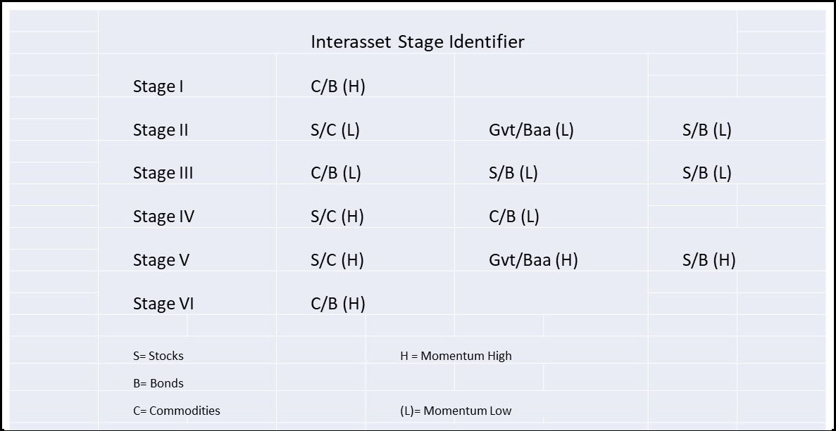
We didn’t have time to cover all the stages, but they and their accompanying inter-asset relationships are summarized in Table 2.
Conclusion –
This seasonal approach to the business cycle is far from perfect, but if consistently followed will put the odds in your favor!
Table 2 — Momentum Turning Points that Approximate Stages as Early as Defined by Our Models
Related Article: How to Use the Business Cycle as a Proactive Risk Management Investment Tool, Part 1