
Every cycle effectively goes through four momentum stages before completion. This is shown conceptually in Figure 1, where the curve reflects a theoretical smoothed momentum series. For our purposes, that smoothed momentum is portrayed by a KST indicator, but there is no reason why an MACD or very slow stochastic could not be substituted. The first phase of the cycle occurs after downside momentum has reached its maximum. At this point, the series turns up, but it’s still below its equilibrium level. The second is signaled when it crosses above its zero reference line. The third phase gets underway when it peaks out from above zero. Finally, phase 4 is triggered when the indicator crosses below the equilibrium point. For simplicity’s sake, the respective stages have been labeled as spring, summer, fall, and winter.
Figure 1 — Long Term Momentum Position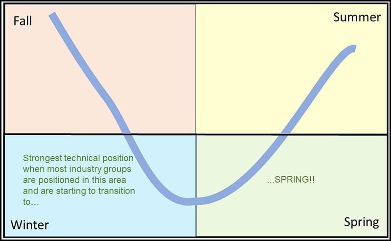
From both an agricultural and an investment point of view, the best results occur when planting (investing) is done in the spring and harvesting in late summer or fall. The significance of a turning point will depend on the type of trend the smoothed momentum series is monitoring. In other words, turning points for momentum calculated from daily data and intended to monitor short-term (3 to 9 weeks) price movements will not carry the same significance as a monthly derived series calculated to identify primary trend turning points.
Reverting back to our seasons, spring represents accumulation, summer the markup phase, fall distribution, and winter the markdown phase. In situations where a market can be subdivided into components, it’s possible to take this approach one step further by calculating a diffusion index based on the position of the seasonal momentum of its various components; e.g. S&P industry groups for a stock market average, commodity prices for a commodity index, etc. In this article we’re focusing on the winter position for industry groups, using the cyclical position of a long-term KST as our benchmark to identify the seasons.
This seasonal momentum approach has two merits. First, it helps to identify the prevailing stage in the cycle; i.e., whether the stock market is in an accumulation, markup, distribution, or markdown phase. Second, it helps focus in on major buying and selling opportunities ─ one of the easiest to spot is the Winter position. Obviously, prices are in full downtrend mode as the number of winter components expands. However, it’s when it starts to reverse that stock market bottoms are formed. That’s because a falling winter indicator reflects the fact that more groups are transitioning to spring than falling into winter position.
Chart 1 — S&P Composite Versus the Winter Position 1957 – 2020
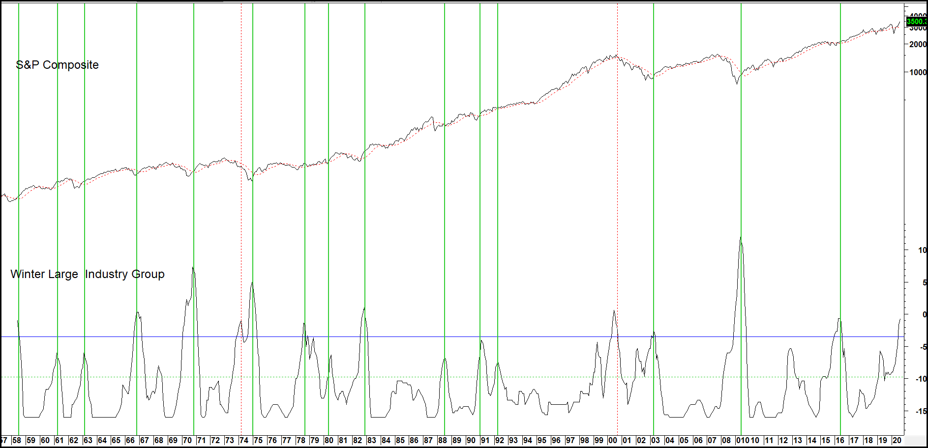
Chart 2 shows the same exercise, but this time the indicator has a much longer history. However, the universe is limited to fewer industry groups since that represents all the available data.
Reversals from above the horizontal line again show consistent and reliable primary trend buy signals. The shaded areas represent secular bear markets when inflation adjusted equities are considered. During those periods, the number of groups moving into the winter position has a tendency to be far greater than in secular bull markets.
Chart 2 — S&P Composite Versus the Winter Position 1923 – 2020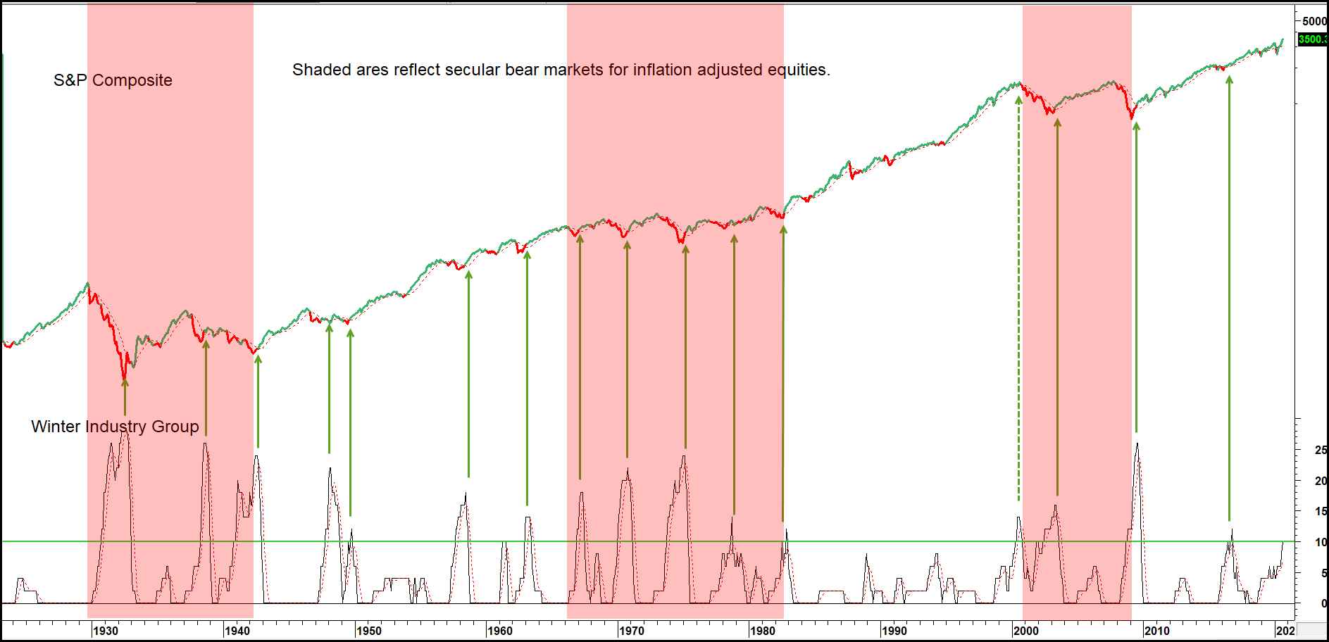
Finally, you will notice that in the year 2000, the winter position maxed out at around the same time the S&P was peaking. That was due to the fact that since the mid-1990s the index rally had been powered by the tech bubble. We can see though from the rising winter numbers, that the market had previously been correcting internally. By the time tech peaked, a lot of industry groups were in a position to rally, which they did. The S&P sold off though because its highly weighted tech component declined. This was a unique situation, but it does point out that while diffusion indicators and indexes usually move in tandem, swings in diffusion tell whether the advance or decline is likely to be broadly based or not. The green and red highlights reflect the bullish and bearish periods as defined by our Total Return Model.
Related Articles: Long-term KST, Seasonal Breadth Summer Momentum